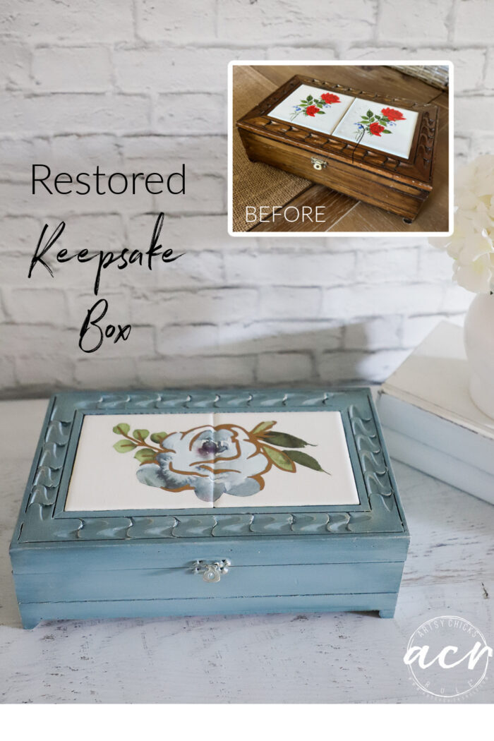
Restored Keepsake Box
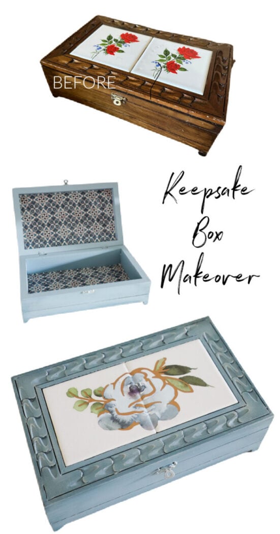
Restored keepsake box to store all kinds of goodies! Easy with paint, transfers, and fabric!
Hello, and happy Trash to Treasure Transformation Tuesday, beautiful friends!
I hope you are having an amazing fall so far. Wow, is it not just flying right on by?! It sure feels like it.
I’m sharing a super cute little makeover today and I’m gonna say I was a little “extra” on this one. Haha
I could’ve painted and done! But like I said, I got a little extra. You’ll see. ;)
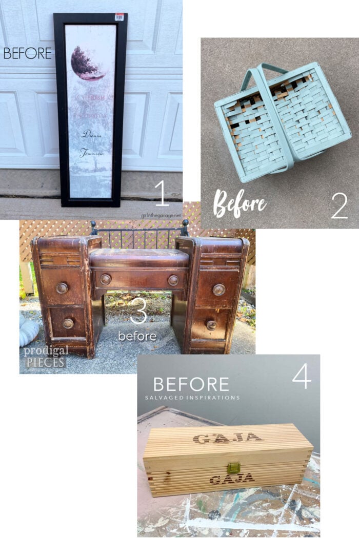
Don’t forget to scroll all the way down and catch my friends’ fun makeovers too.
Restored Keepsake Box
You know me and my box makeovers, right? I’m a sucker for a box.
I have made over SO many here on the blog. I need to do a round-up of them all soon.
Kind of get them all in one place so we can do a little revisit on them.
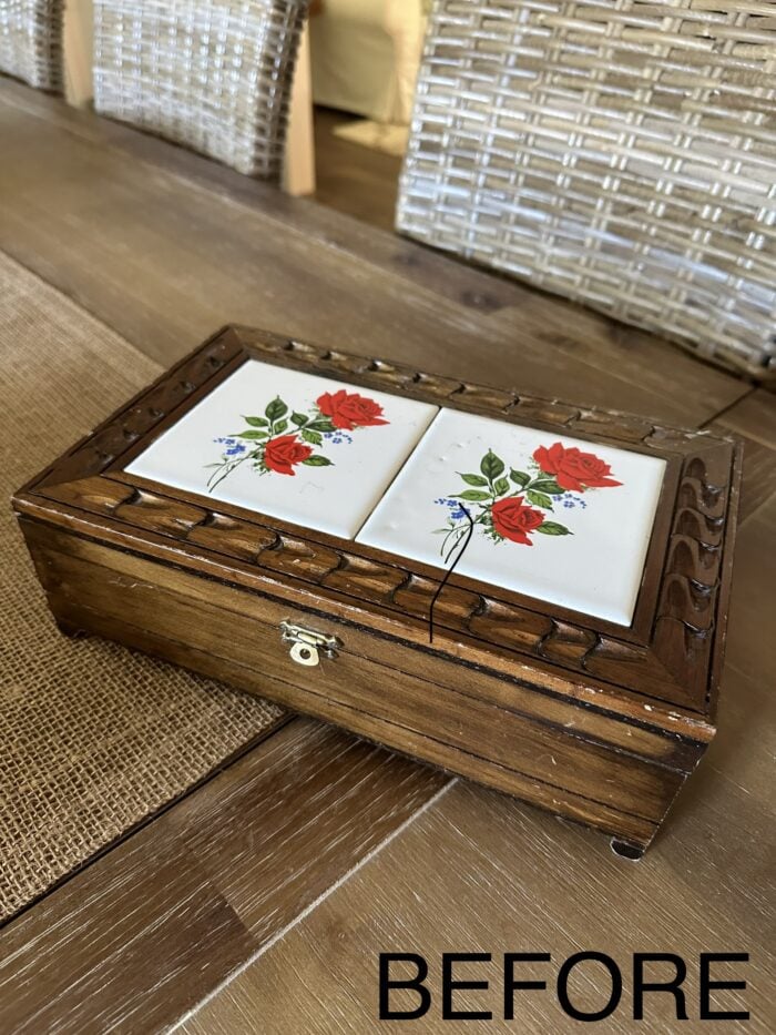
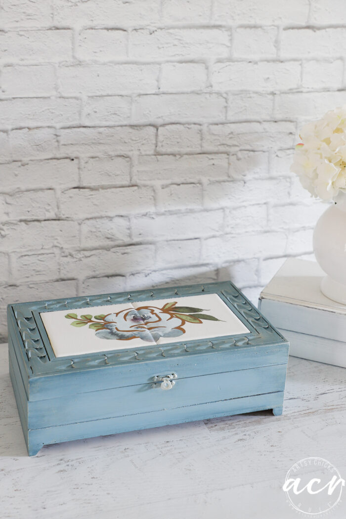
But today, let’s talk about this little $4 cutie.
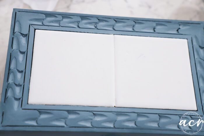
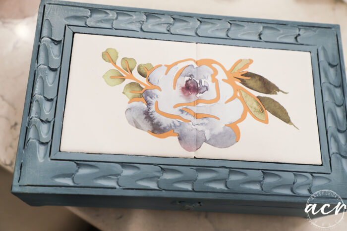
I loved the wood detail on the top which made it different. I also loved the fact that it had tile as that gave a little different touch too.
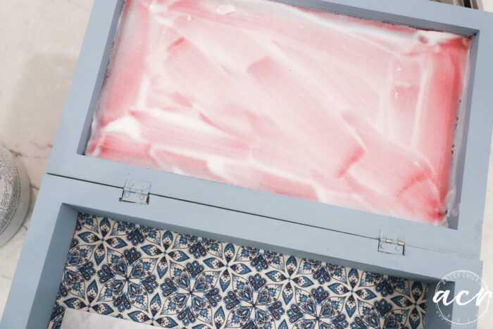
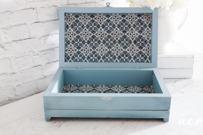
Here’s the inside…
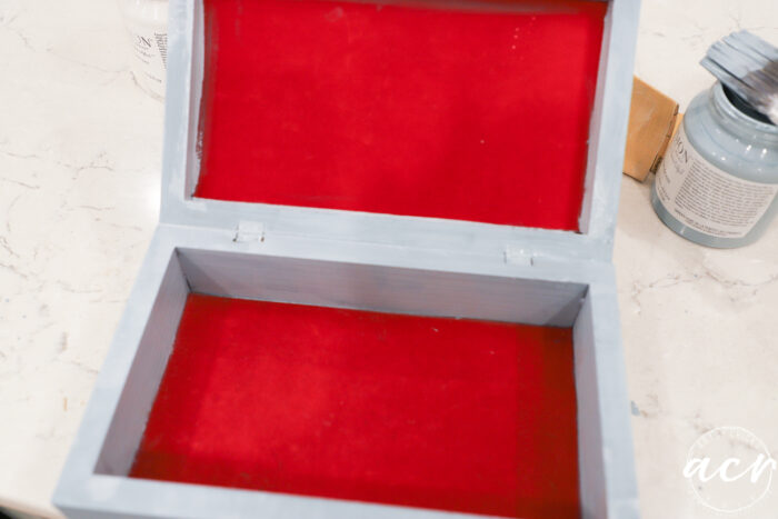
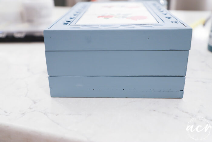
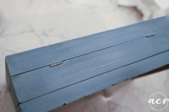
And yes, it is indeed already being painted blue because oops, I forgot to photograph it before I started painting.
As you can see I used blue paint. Here are all the things I used:
MATERIALS LIST
- SAND
The finish was a bit shiny so I lightly sanded the whole thing so the paint would grip better.
2. PAINT
Next, I painted with the Champness. 2 Coats.
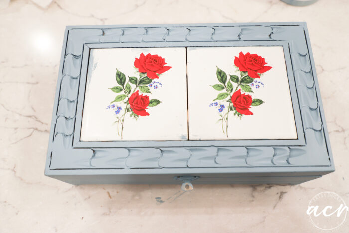
Great color but “eh” with all the fun wood design on top. Am I right? Yes, I am and I’m gonna fix it. ;)
3. ULTRA GRIP
While I waited for the paint to dry in between coats, etc., I brushed some Ultra Grip onto the tiles.
They are slick and I wanted to make sure the paint would grip well.
4. ADD DEPTH
Now for the fun part.
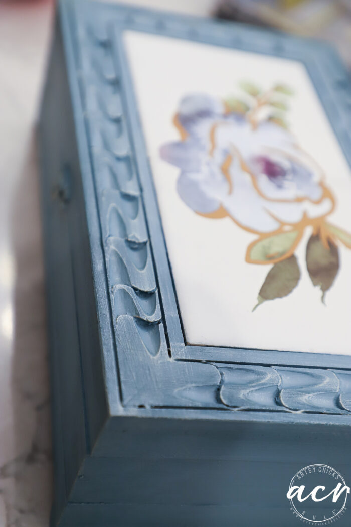
As I mentioned, pretty color but I wanted to make it pop.
I added a darker shade of blue (Seaside, I adore this color) to add a little depth.
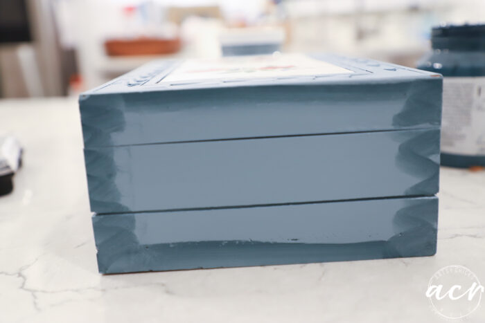
I dipped a small artist’s brush in the paint, wiped most away, and then applied just around the edges.
Then I took a rag (old sheet) dipped in water (not dripping, just damp), and wiped the paint around the edges, leaving the middle mostly light.
If too much paint came off, I simply added a little more and blended again.
This is similar to what I did on our coffee bar dresser. You can see that project, right here.
Let me preface this before I go on. I had a terrible time trying to pick up on camera what I was seeing in person.
The picture below shows the top after I’ve added the darker blue. You might be able to tell how the inset areas are lighter.
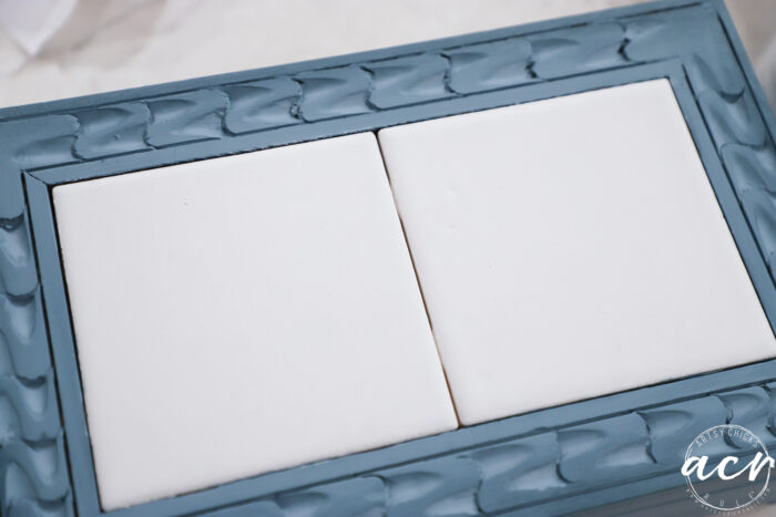
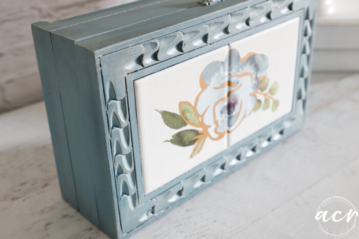
5. PAINT THE TILE AND ADD TRANSFER
You can also see above how I painted the tile. I used “Casement” and it took several coats.
I didn’t love the middle space so caulked it.
Once that was dry, I painted over it to make sure it matched.
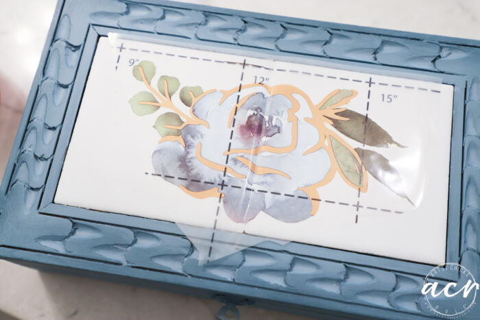
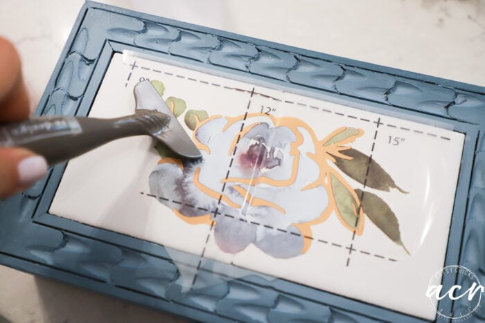
Then I applied this pretty blue floral transfer. I used a transfer tool to transfer it to the keepsake box.
I used this same transfer on nesting tables recently. You can see it here.
6. ADD GOLD ACCENTS
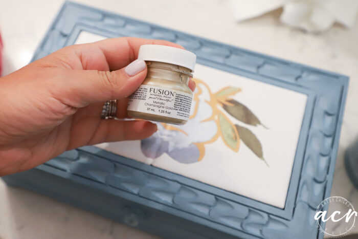
I decided to go one step further and give it a bit of dry brushing with this pretty gold paint.
Yes, that’s it. It’s subtle but shimmers nicely. (pictures are hard to capture)
Can you see it?
Want to know more about dry brushing?? Check out this post here: How To Dry Brush
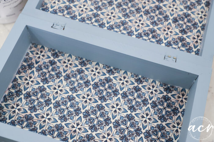
7. NEW FABRIC LINING
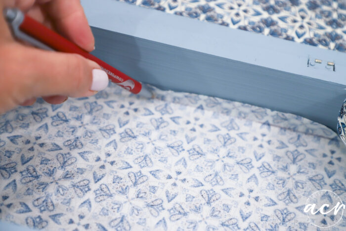
I measured and cut out the fabric to be just a tad too large. Then I turned it backward and drew a line where the edge was.
Next, I cut it on my cutting mat (it’s great because it makes a perfectly straight cut…you can get it here)
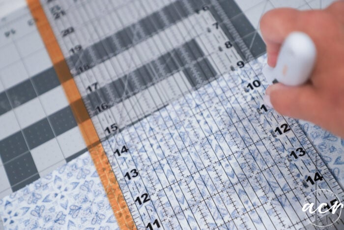
Then simply used Decoupage Gel to attach it to the inside. (I didn’t bother removing the old)
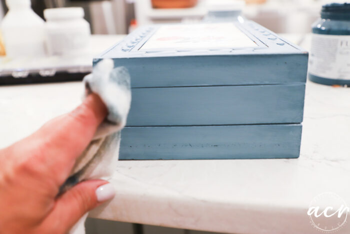
8. POLY TOPCOAT (on the tile and transfer area)
I finished up by applying a coat of poly over the transfer/tile area.
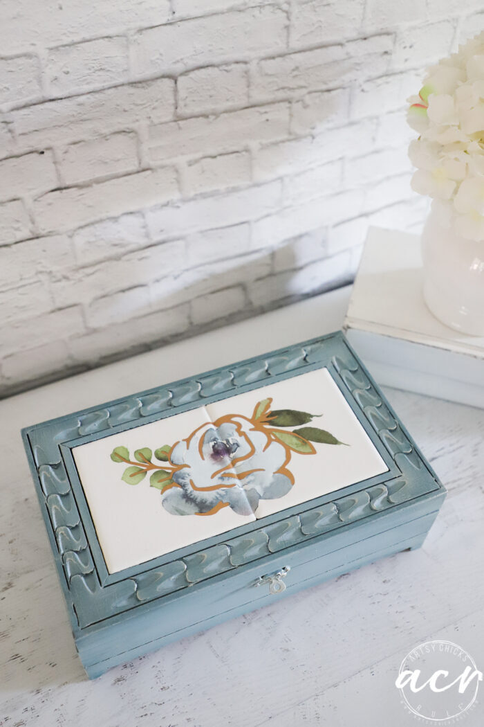
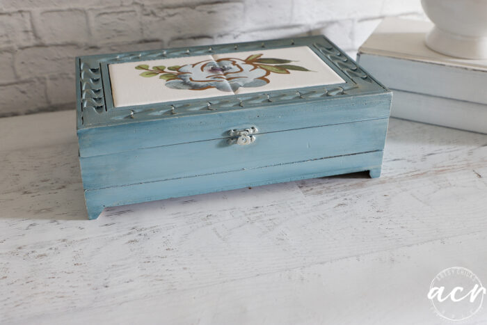
Love the depth the darker blue adds. (see it on the side?) And the “extra” the gold adds too.
Can you see it a little better in this shot??
I went back and forth on whether I wanted to do “two tiles”, with images on each. But I’m glad I went with this look instead.
I like how it centers the piece. The two images on the original were odd to me.
I think this looks so much better.
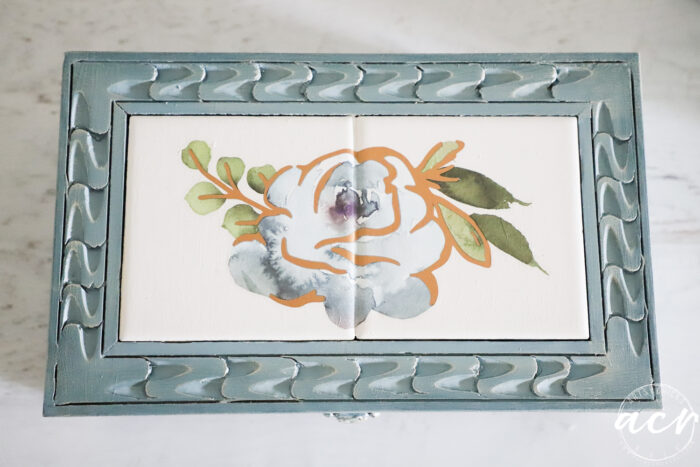
I also considered leaving a tiny gap between the flower where the “grout” would be.
But I also decided against that too!
And I’m glad about that too. lol whew!
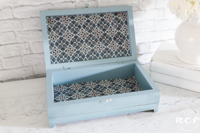
The fabric was just something I had in my stash…and it was blue so in it went!
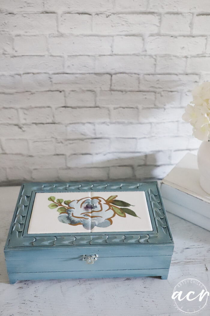
You can really see the darker blue on the front of the keepsake box above.
Perfect little box for keeping things. Restored, restyled, and ready to be reloved!
PIN it to save it!
Now hop on over and visit my friends below!
I hope you enjoyed the makeovers today! I’ll see you right back here on Thursday.
UPDATE!! Check out this super fun project now here!
Have a wonderful week!
xoxo


")

")


Beautiful new look, Nancy.
Thank you, Larissa!
You are so talented!!
Thanks, Denise, always fun making over these little boxes! xo
I love the new look Nancy! XOXO
Thanks, Denise! xo
What a gem this is now. All the colors work so well together. The little touch of shimmer makes it. Is there any way to fill in the middle so it would be one smooth surface? Just curious. I’m headed over to your other friends to check out their creations.
Thanks so much, Kathy! And yes, the shimmer is the best part! So bummed it doesn’t show well in the photos. You know, I considered filling in the middle all the way with the caulk but I was concerned I might not be able to get it perfectly smooth, and then it would end up looking like I tried to fill it in, instead of looking like two tiles, etc. So I didn’t! But really you could. xo
What a great find that was and it turned out SO pretty!! I love effect of the two blues! XOXO
Thanks, Christy! I love layering similar shades! xoxo
I like this refresh Nancy! The color choice is great and between the transfer and fabric it all just blends nicely.
Thank you so much, Niki. I love making over these little boxes inside and out! xo
Hi Nancy! This was just what I needed. I am upcycling an old silverware box and I wasn’t sure if I needed to use fabric over a foam board or if I could just decopauge the fabric. And advice? Your box came out so pretty
Oh yes, you can! Now, there may be a slight caveat to it though as I noticed a tiny bit of bleedthrough in a spot or two. Not terribly noticeable once it dried, however. But something to keep in mind! And as having to put it over foam board, I don’t think that’s necessary in this case. Thank you, Cheryl! xo
So much better, Nancy! I was starting to wonder where you were going, with the blue and the original tiles 😂 Although it’s hard to see in your photos, the extra paint steps add depth.
Thanks, Marcie!! And right?! That wouldn’t have looked so great! haha xoxo
Nancy, that is absolutely gorgeous! I love what you did with the tile. Such an improvement over the red flowers! (Nothing against red flowers, you understand.) I’m really impressed that you got the transfer to work so well on the two tiles. You are one talented gal. Can’t wait to see what you do next.
Thanks, Naomi! Oh no, I am in agreement there! Transfers are the best…they make everything beautiful and new! xo
What a great new look, Nancy! The blue is very pretty with the new transfer! xo
Thanks, Jen! xo
This is so pretty! I think they way you did the tile is perfect💙.
Thank you, Vicki! Love playing with all these pretty transfers! So many ways to use them! xo
Wow, I have been running away from these chunky little boxes with all that heavy carving, but look at what you did with it. You have given me the curouge to tackle a couple of these!
Oh, yay, I love that! Yes, go get em! I love all the carvings on things because you can layer colors, etc, so nicely on them. Remember, if you do paint it and don’t love it, it’s so easy to just paint over it and begin again! It’s just paint, right?! :) xo