A Few Home Updates (choosing coordinating finishes, etc)
Renovating can be fun….and frustrating! It’s sometimes hard choosing coordinating finishes and such. But once you get rolling, things usually tend to fall into place nicely!

Hey friends! I thought I’d share a little update on what’s going on around here in this war zone…I mean home renovation. ;)
And yes, it really does look like a war zone since we decided to stay put for a few more years and do several more renovations instead.
It’s hard living in your home while you paint walls, ceilings (especially ceilings!), replace all the flooring, add trim, put in a new kitchen…and more.
I actually bought some boxes over the weekend and started putting some of the decor away so we wouldn’t have as much “mess” out and about once we were ready to tackle the flooring.
We may even rent a POD so we can move everything out and replace the flooring and kitchen cabinets without having to move everything back and forth to do so.
We already went down that path several times in this house. We installed the flooring in the family room area about 10-12 years ago, the kitchen vinyl tiles about 8 years ago and refinished the original wood flooring about 6 years ago. So we know all about moving things completely out of one room and into another (also known as, cramming it all in, lol). And that’s the reason we thought a POD might be a good idea this time. ;)
If you’ve been following along on Instagram, you’ve already seen just about everything I’m getting ready to show (and tell) you.
I’ve shared most of it as I’ve gone along over there in my “stories”. So be sure to follow along for the future reno as we get to it!
Okay, so let’s start with paint.
In this post, I talked about the paint I was trying to decide between. What a dilemma!
I wanted to get far away from the yellow that it was but didn’t want too cool, or gray.
Plus I really, really wanted to go lighter. Light and bright without any weird, off tone paint.
That’s tough you guys.
Finding the perfect neutral that is not too yellow, not too gray, not too dark not so light that the white trim doesn’t pop, either.
Ha! That’s a tall order apparently. ;)
I had originally narrowed it down to SW Natural Choice and SW Pearly White.
As you know, I ended up deciding to go with Natural Choice…..then I wavered, too dark.
Then I ended up going with Pearly White….then I wavered again!! ;)
Once I had bought the paint and started painting a wall larger than the area I sampled, I realized I was not going to be happy with it. It was looking really WARM.
Which is okay, but I was so tired of the yellow that I didn’t want any part of warm at this point.
Both are really great colors however, they just ended up not being right for me.
So I went looking (and looking!) and found Benjamin Moore’s “Pure White”.
Since I love SW’s Harmony paint, I had them match it and make a sample for me.
And it was a win!!! I knew immediately this was THE ONE.
Light and bright and airy…..leaving just enough color for some nice contrast with the SW Extra White trim.
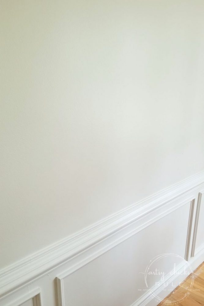
Don’t let the name fool you, it is not PURE WHITE at all.
It’s really hard to tell in the photos but its got a slight hint of gray but it’s a warm gray tone, not too cool….which is perfect!
And NO yellow to be seen anywhere. Yay! :)
I know it’s really hard to tell in these photos, but there is a nice hint of color on the walls.
I feel like it’s the perfect white if you are trying to stay away from the yellow, creamy, off white shades.

By the way, I love yellow and really enjoyed it on my walls for years. But you know how it goes, sometimes you just get tired of it after awhile.
And so, time for change. :)
I’m going to be painting the study and kitchen the same color, Pure White.
Which moves us on into that room. I mentioned in the other post how we are planning to install white, shaker style cabinets.
And I also mentioned that I adored the Fantasy Brown Granite I saw at a cabinet shop. The only thing is, every other sample/slab I have seen of it since is way too green, brown and busy. :/
I’ve seen several large slabs at various places so I feel I’ve gotten a good representation of what I’d be getting.
So I moved on from that one.
I reconsidered a marble look in keeping things light and bright in the kitchen and found this….
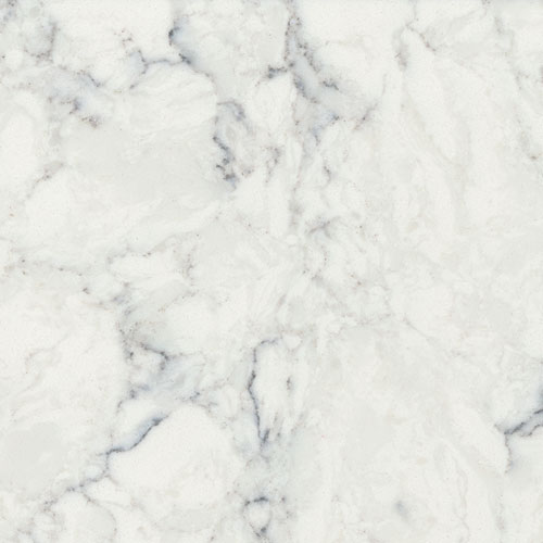
Viatera Rococo (source)
It’s beautiful. If you do a Google search, you will see many examples in kitchens.
And this one….
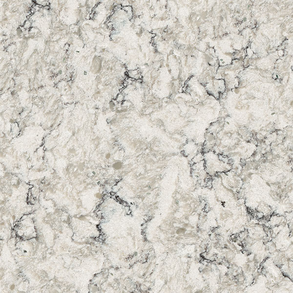
Viatera Aria (source) Also really nice, but with a bit more color.
And my favorite….
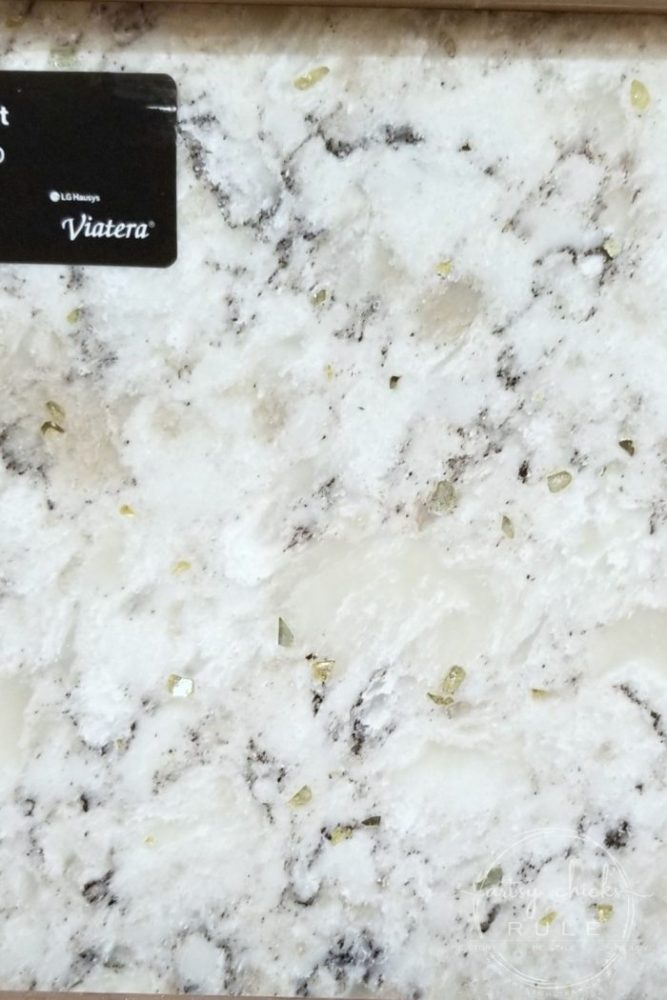
Viatera Everest
Its got bright white splotches, with black/dark gray veining, a creamy warm gray color and those gorgeous pale greenish crystal stones that just twinkle beautifully!
Hey, I’m a sucker for anything that sparkles, what can I say? ;)
I *think* it might be the winner.
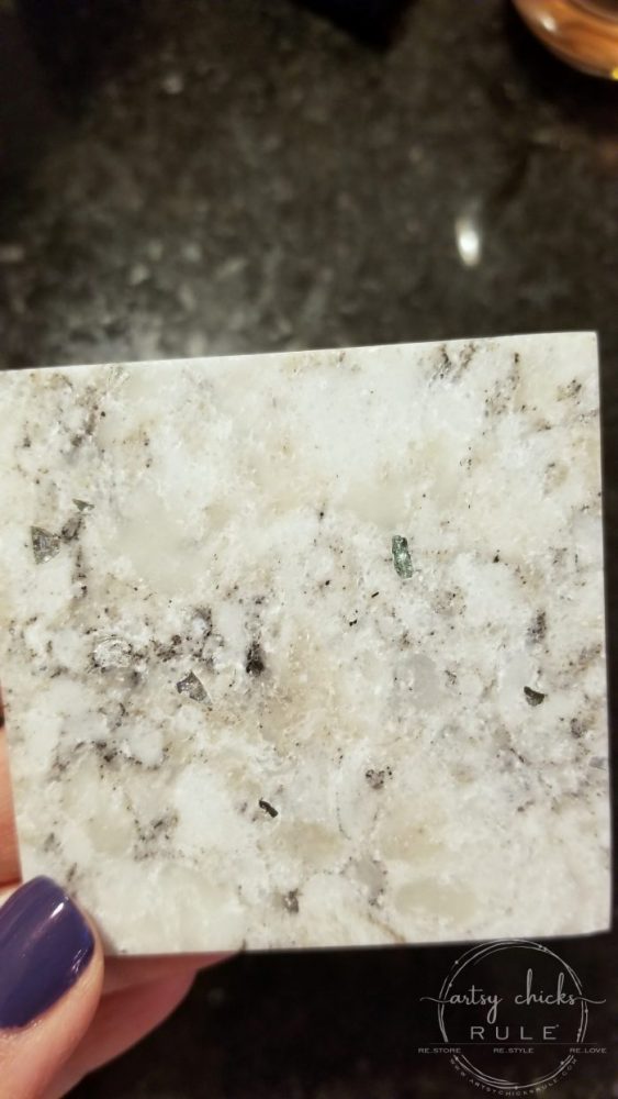
We have only seen these small pieces so far but plan to go the yard to see the big slab this week.
Keep an eye out on my Instagram stories as I’ll be sure to snap a shot of it when I do! :)
But in the mean time, look how nicely this sample goes with my new paint color.
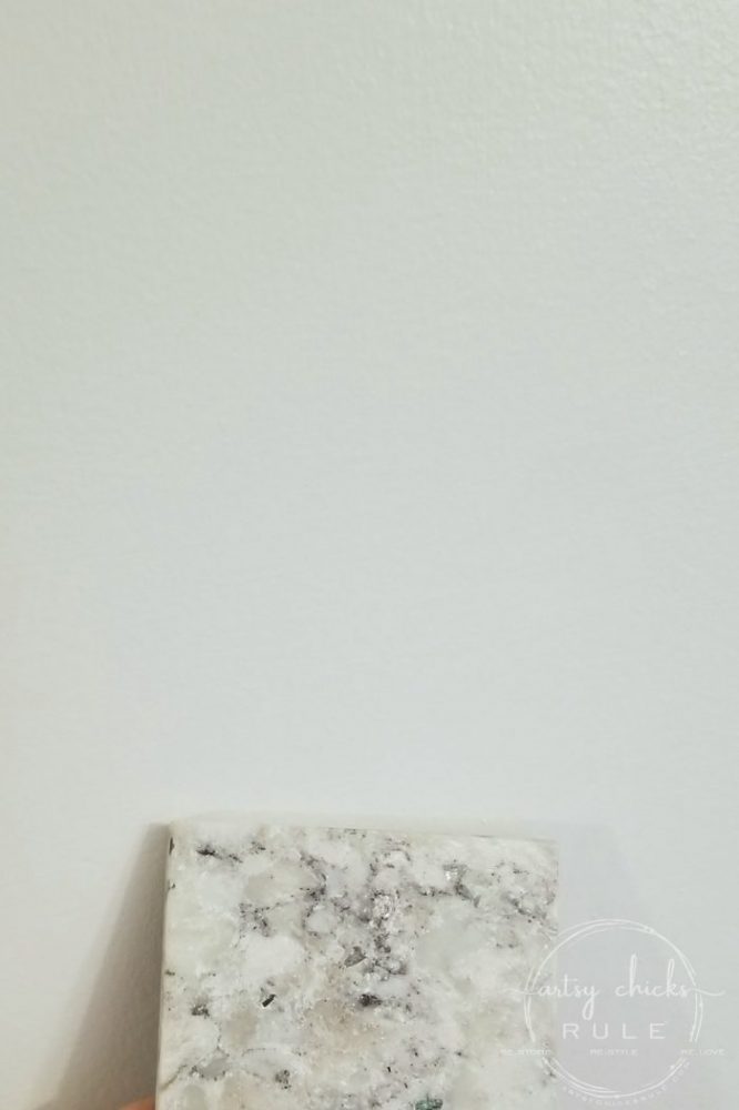
Those creamy warm grays blend perfectly with the new warm gray wall. Love it!!
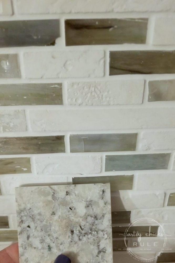
And I think it will go nicely with the coastal tile backsplash, too.
I’m undecided on what color I’ll repaint the kitchen island just yet, so stay tuned.
Here are the contenders so far:
SW Halcyon Blue
SW Oyster Bay
BM Beach Glass
I’ve got a few samples of flooring coming in on Weds. I can’t wait to see them in person and share them with you!
I’ll be updating this post with photos once I get them.
I’ll also share those on Instagram, too. ;)
Now that I have my wall color, cabinets and counter top color (I think ;) ) it will be nice to see which color flooring goes best.
Choosing coordinating finishes can be hard but once you get going and choose one or two things, it often just flows.
I will say that it usually goes something like this….find counter top you love, then choose a coordinating floor, then paint, etc.
I sort of did it the opposite way, only because I hadn’t planned to replace cabinets/flooring, etc, when I started down the paint path.
But choosing the coordinating finishes all worked out just fine anyway! :)
Besides changing all the finishes downstairs, we are also doing a small change in decor here and there.
One of the changes was adding a love seat to our family room.
You might remember we have IKEA Ektorp furniture in there currently….and love it!
I love how crisp and white this furniture is and the ease in which to keep it that way.
Just pull them off and wash! They come nicely clean and look fabulous again.
See where the chair is at the front of the photo?
We decided to place a second love seat there instead.
We originally had leather furniture, a couch on the wall and a love seat here anyway.
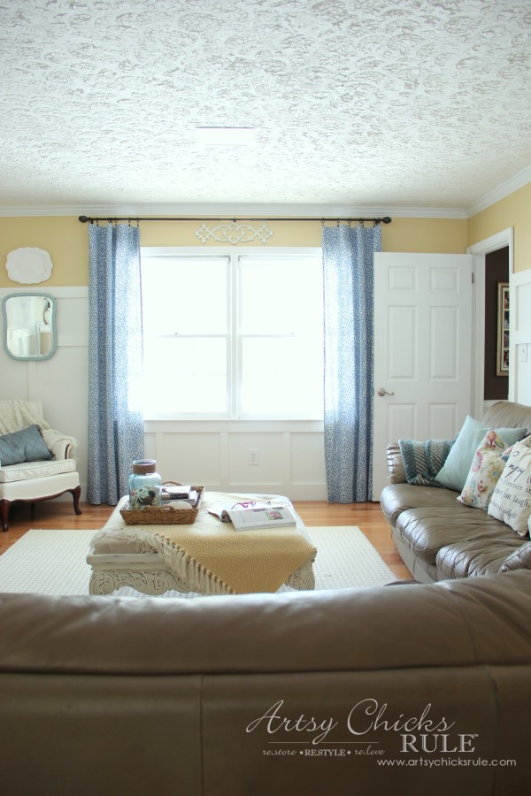
(and see those old yellow walls I mentioned earlier!)
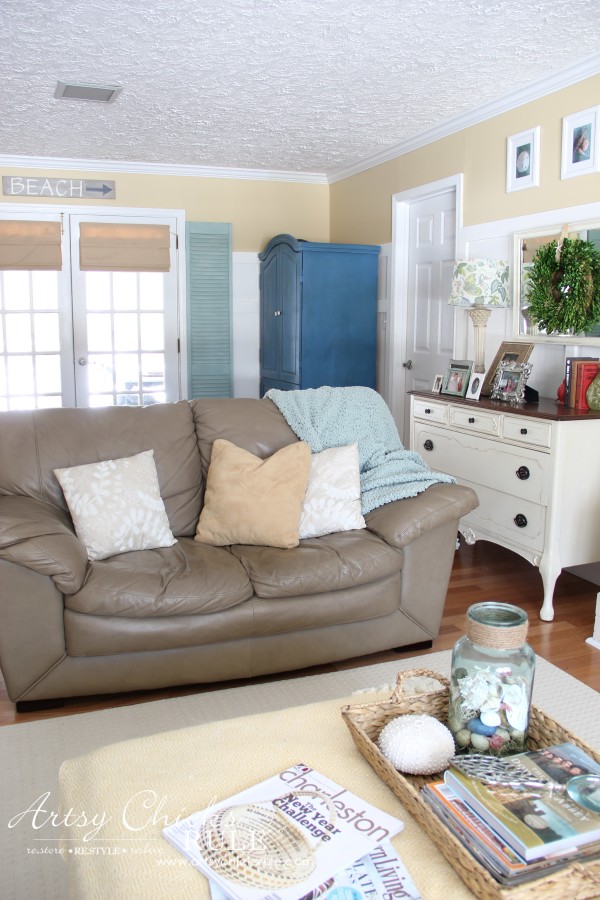
When we sold that furniture, I decided to keep it a little more open and opted for the chair there instead.
But that didn’t really leave enough space for seating especially since the other “couch” on the wall is a love seat as well.
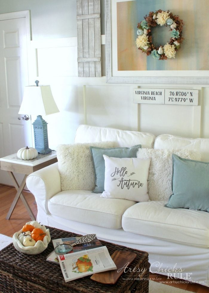
I’m absolutely thrilled with how it looks with the 2 love seats BUT……
….not too happy with IKEA. :(
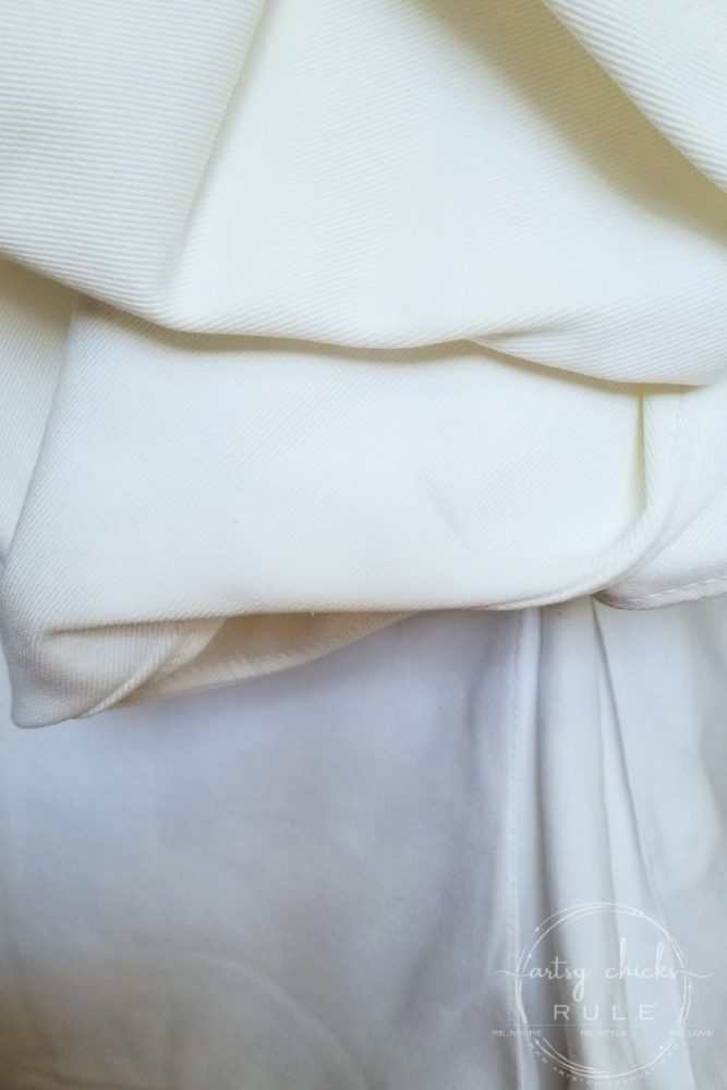
Their Vittyard White….well, it’s no longer “white”….as you can see there.
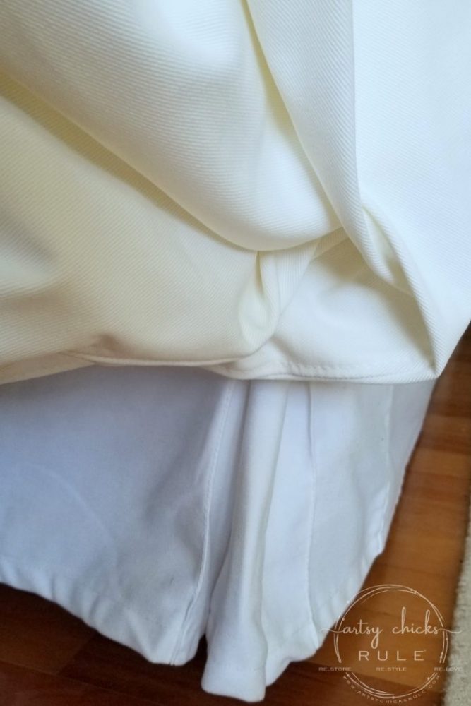
It’s off white now.
I called and spoke with someone as IKEA and unfortunately this is the color now.
Which is really a bummer for anyone that bought the Vittyard White and thought they could buy extra covers that would match any of their current furniture.
It won’t, don’t bother. :(
I considered buying replacement covers from them to match the rest of my furniture in here. (that I only bought a little over a year ago, by the way)
But I don’t love the new color, so I won’t be doing that. I love the crisp, bright white it was originally and am so sad they changed it.
So I will have to purchase covers to fit elsewhere. Not too thrilled but what can you do?
And that pretty much wraps up my update on all things house and renovating. :)
We’ve got a lot going on around here but I plan to continue my series I mentioned in this post last week. (“going back to basics”)
I’ll be back on Thursday talking all about chalk style paints…26 of them!
UPDATE: You can see it now >>> here!!
Have a wonderful week and I’ll see you then!
xo


")
")


Do you know about Bemz? They make covers for Ikea furniture …. I have had great luck with their sleepovers. You can fine them online at bemz.com
Oh yes! I have! One of my Instagram followers clued me in to them when I posted this there. I think I am going to order one and see if it matches. Would be nice if it does and I don’t have to order all 3 pieces! :) Thank you Denise, it’s good to know you’ve had good luck with them! xo
I might go with Sea Glass! I saw that and loved it, but Atlanta is land locked! No center island in new house. I chose SW Alabaster for the cabinets. I was going for a bit creamy not totally white! I have beige porcelain floor tile!!
Good luck! The struggle is real!!!
It’s a lovely color Carrie! :) The SW Alabaster is a nice color too, I looked at that one! And thank you, yes, the struggle really is real!! lol :) xoxo
I love the countertops you chose but think the backsplash is too busy. I would go for a solid color backsplash — maybe black glass or the shiny subway tile?? We all have opinions, that’s what makes the world go around.
Hi Linda! Thanks! And yep, we all have opinions and hopefully different ones. I love to hear them all! :) We’ll see how this all goes together once I get the counter top in. (if that’s the one I go with) The tile is already in so hopefully I’ll love it! ;) xo
LOVE that last counter-top ‘color’… looks perfect all the way around! So sorry about the IKEA issue! I’m looking at the cover on my chair (purchased a little over a year ago), and you’re right… it has a bit of a cream tint to it. =/ Looks okay with my tan love seat, but I understand your frustration! Let us know what you end up doing!
Thanks Julie! I am in LOVE with that one too. We haven’t had a chance to go look at a big slab yet though! Sooo hoping I’m going to love the pattern on a large scale. :/ And yes, that IKEA has me so not happy! lol Can’t believe they changed it. Oh well! Onward!! ;) xo
Loving a glimpse at all the possible changes! Love the new counter choice too. It stinks that IKEA has done that…there will be a lot of unhappy customers I’m sure! XO
I can’t wait to be done!! Not moving for a couple more years but maybe my home will feel brand new instead! ;) xo
I haven’t begun the daunting task of re-doing the kitchen but it needs to be done. I’ve been searching for colors and possibilities forever, it seems. Our cabinets are honey oak (bleh), countertops have a pinkish tone and plain walls with on off white tile. I’m not up to re-doing the floor but the rest…”It’s Game On!”
I rarely…ever keep a blog post but this one is a keeper. I love your countertop material and I never lean towards granite, quartz or marble. I was thinking wood before seeing this.
Love it all. Like the yellow and like the new color. You make me a little excited to get going on everything now. I’m also painting the den which is currently blue. It’s stunning but too much.
Hi Zanetta!
I’m not up to redoing our floor either!! lol But I suppose we are! ;) It’s a bit of a daunting task when you live in the home, for sure. I have found another quartz that I’m really loving. There are SO many options these days!
And that makes me so happy to hear that you are excited to get going on yours, too. That is awesome!! I love that little spark we get. That’s what happened when we decided to stay put for a few more years, I got excited to makeover the house all over again! Good luck with your kitchen and your den. I love how just a new paint on the wall can really freshen up a space and make it look brand new. :) xoxo
It’s a lovely granite, but personally I’d go with a simpler quartz. Your backsplash has a lot going on, so a solid, or mostly solid quartz may be a better option. Also, quartz is more “in” than granite and you can’t beat zero maintenance….but I know you have to go with what YOU like,
I recently updated my dining room with shiplap. The color I used was Behr’s Ultra Pure White, and I love it! Most people shy away from stark colors, but it really worked. While perusing Pinterest, I discovered I’m not alone. Leanne Ford from HGTV’s Restored by the Ford’s used it all over her restored farmhouse. Score!
I am shocked about Ikea! I was going to buy an Ektorp sofa, but not if they changed it to off-white. Yuk! Thanks for the heads-up.
Hey Lizzy!
I am in LOVE with this quartz so I’m hoping it won’t be too busy. You may be right though. :/ I wish I’d not redone that backsplash so recently or I’d have better thought all this out. If I’d known we were gonna stay a couple more years I wouldn’t have done that. I think we are going to move forward with it and just see how it looks. And then redo if necessary.
That Behr color is a great white!
And I know! Not too happy with the new color however, when not directly side by side (like in the photo), it’s not as noticeable. Certain times of day and lighting, I can tell it’s not bright white like the rest. But sometimes I can’t tell as much. Either way, I’m still planning to find a replacement that is white white.
Thanks for the input on everything, always appreciated!! :) xoxo
OMG! I looked at that Coastal backsplash today! But I live in the desert with a heart for the beach. I am gutting my kitchen any minute…if I can find someone to do it. I’m going with IKEA for my cabinets and letting them install. So many things to take into consideration! You seem to be breezing through and I am totally freaking out! I need everything but the stove & microwave, including the kitchen sink! Going with grays and a deep gray/teal with a brushed nickle accent for the backsplash. Then comes the floor…
Nancy, thanks for all your inspiration!
OH Carol!! haha…I am so glad I come across that way!! I wish we were breezing through!! ;) We are trying but oh my, my house is turned upside down and I’m just ready to get back to normal. And I’m freaking out a bit too because I just got major sticker shock on the quartz we like! lol We are going to replace all the appliances, too, to stainless. (lightening it up in here!) The colors you are doing sound really nice! I hadn’t thought to look at IKEA for the cabinets. Might have to check them out. Good luck with your remodel. It’s tiring but so exciting!! xoxo
Dear Nancy,
I love your choices, and I completely understand about the yellow. I have a red brick, 900 sq ft tiny house with dull mustard colored siding. Gross and I’m so OVER it! The house is older than me and in need of lots of updates… lol… another project. I have lots of ideas and keep hoping that I might win the lottery one of these days, haha! Anyway, you give me so much inspiration, Nancy and I want to thank you for sharing your ideas and projects. You’re one in a million girlie!
Sincerely,
Jane
Hello Jane!
OH yes, and when you get over it, you get OVER it, right?! ;) Always another project! I’ve certainly learned that with this 40 year old home! lol And I know what you mean about ideas. I have more than I can accomplish! They just keep coming. That lottery would be so nice. ;) Thank you so much for the kind words. That makes me so happy to hear that my projects and ideas give you inspiration! I love that and that’s my hope for the blog! Blessings! xoxo