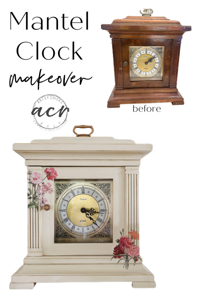
Mantel Clock Makeover
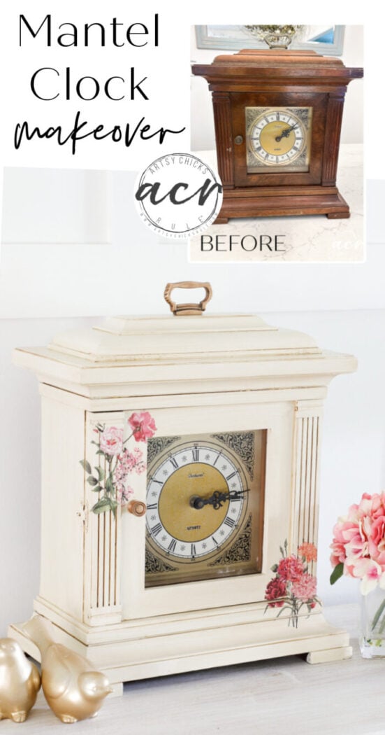
This mantel clock makeover was simple with paint, transfers and antiquing glaze!
Hello and happy Trash to Treasure Transformation Tuesday, friends! Today my friends and I are getting together to share our latest finds. We share the second Tuesday of every month.
I hope you all had an amazing weekend. It’s been SO hot and humid here. Crazy humid. But that is par for the course in these parts.
I still love summer though!! haha Although even I wouldn’t mind if it would lighten up a little on the heat and humidity.
I’m sharing this very cool mantel clock I picked up on sale a the thrift store a few weeks ago. Don’t forget to scroll all the way to the bottom to check out my friends’ makeovers too!
Mantel Clock Makeover
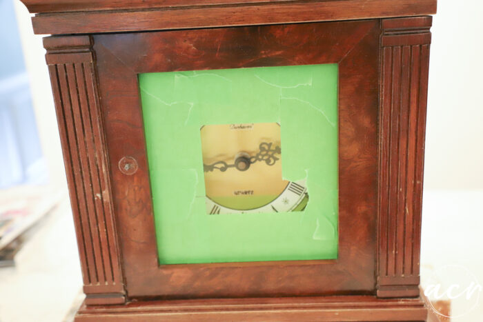
Well it looked like this when I found it.
BEFORE
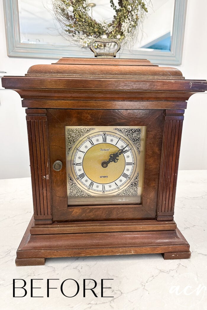
Eh.
This was originally marked $24.98 I got it for $7.98.
After cleaning it up and lightly sanding it I actually considered keeping it wood and maybe just darkening the stain a bit.
But nope!
Paint won. ;)
I should note that the clock does work. It is battery powered (so it’s not old). It even chimes on the hour!
MATERIALS LIST
SANDING
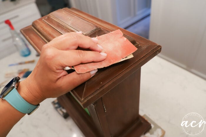
So after lightly sanding all over and wiping that down, I taped up the glass in front.
And began painting.
PAINT
Raw Silk …
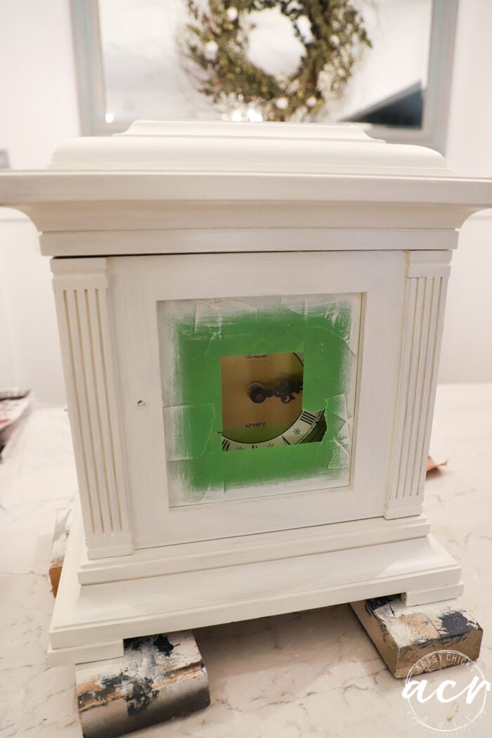
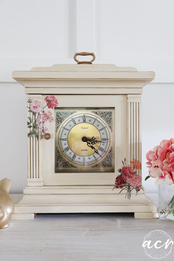
It’s a creamy off white shade. I thought the antique feel of the color would be perfect for this piece. I did not want to do it stark white.
Another coat…
It took one more coat to really cover it well.
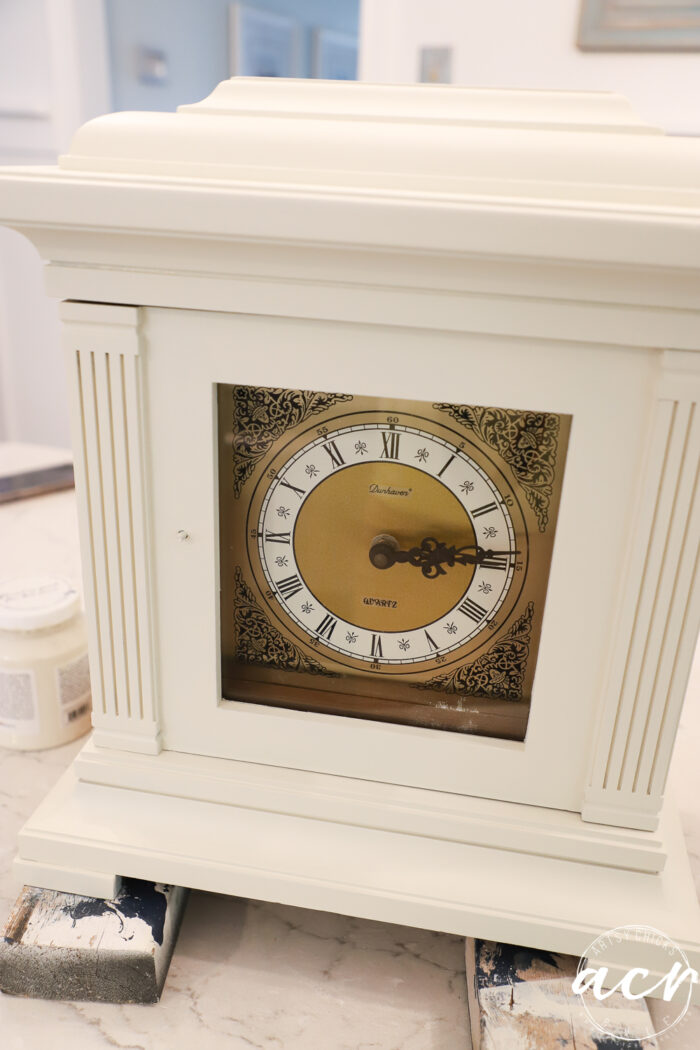
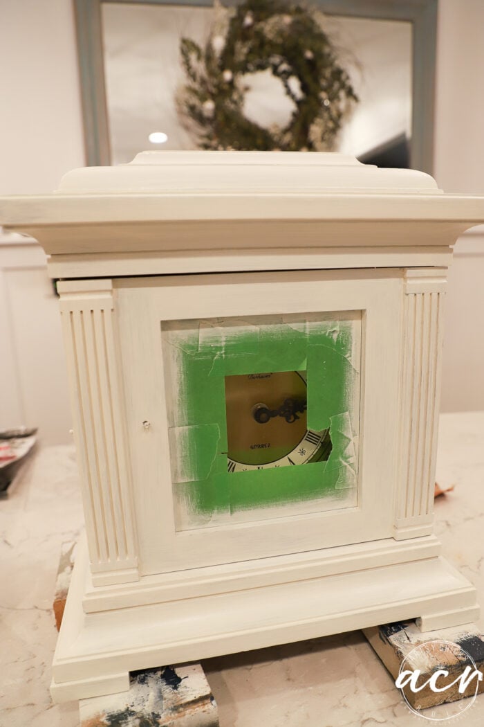
I pulled the tape off and this is what it looked like. Could call it good here but I wanted to do more.
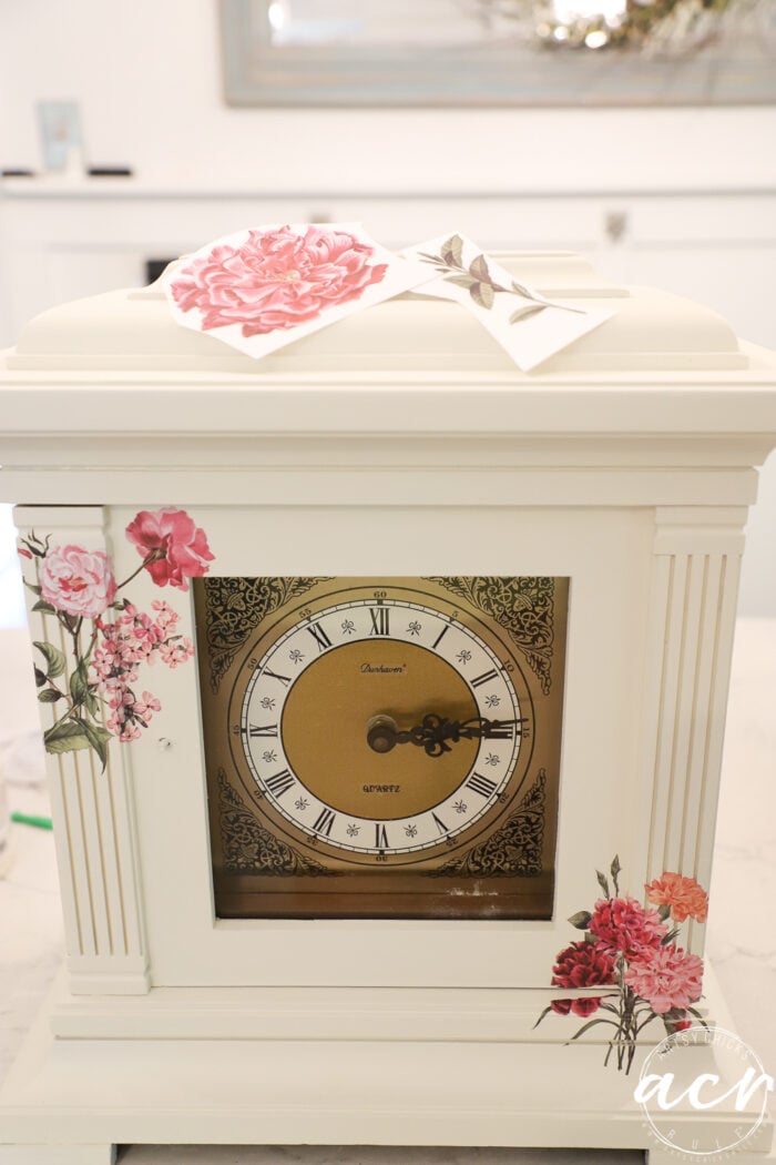
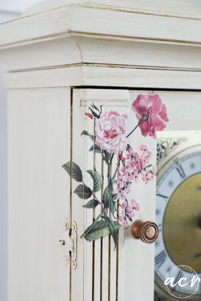
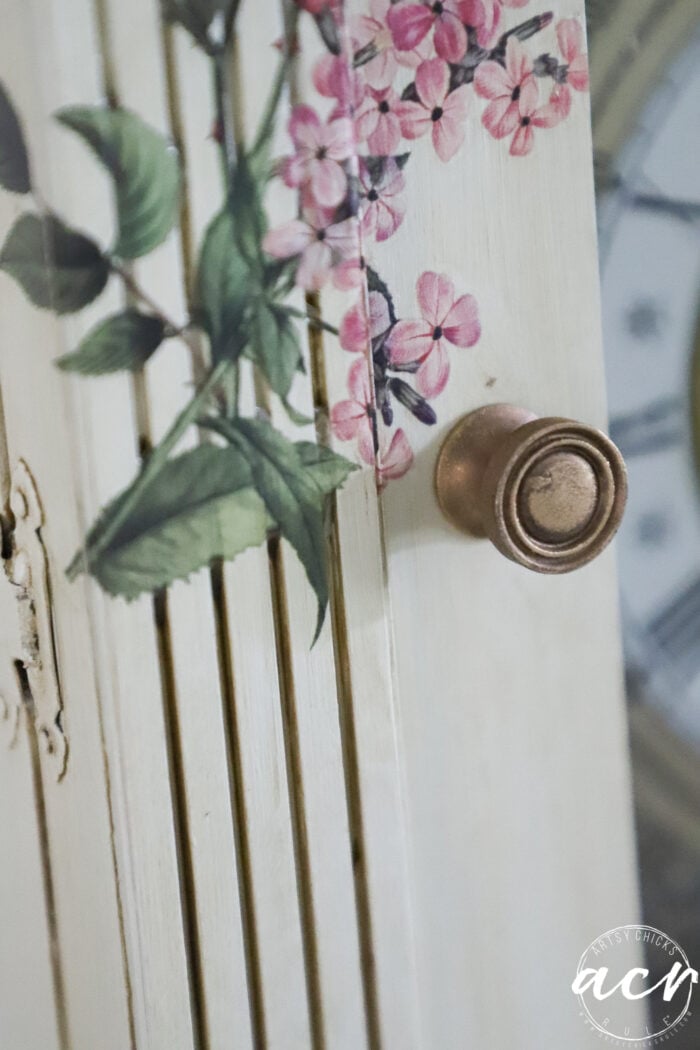
So I pulled out my transfers and used this one… (linked above in “Materials List”)
TRANSFERS
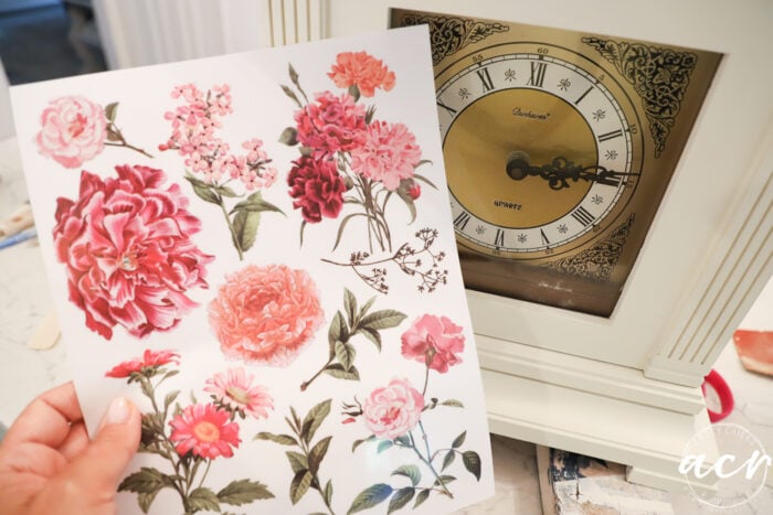
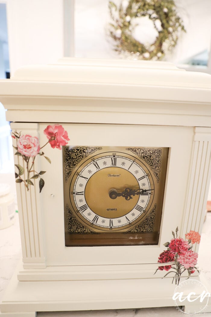
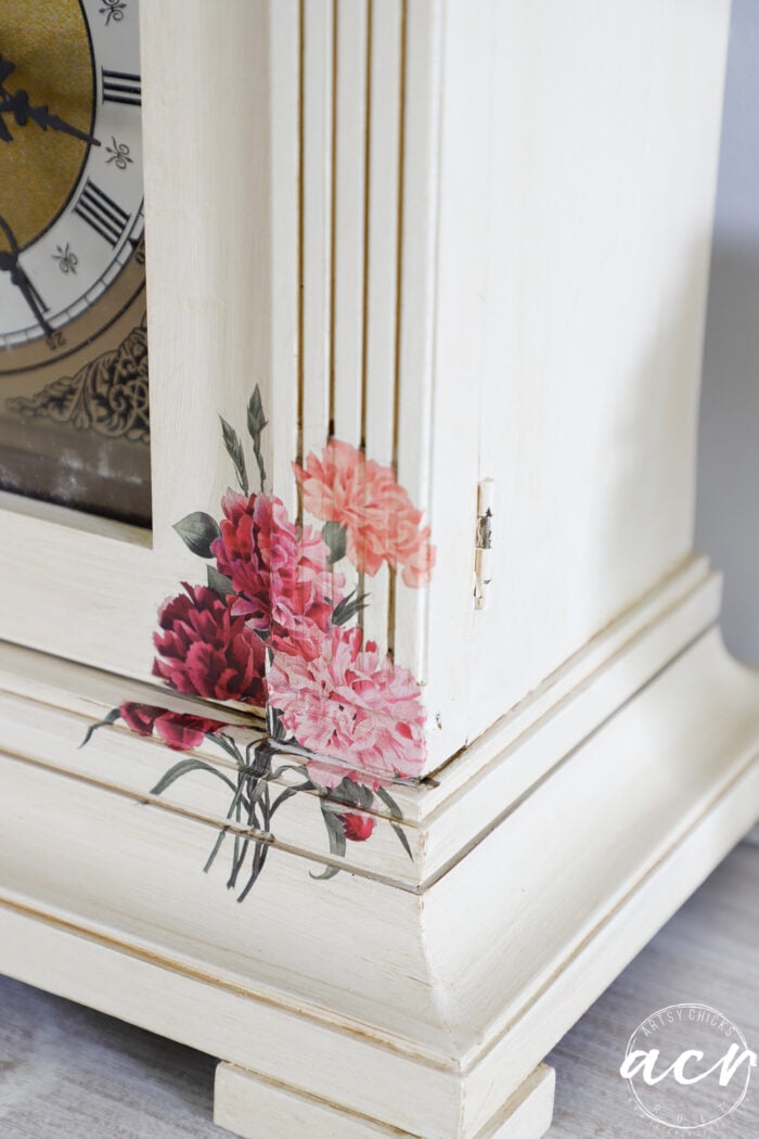
I was going to do more but started with the corners and decided to leave it at that.
The transfer on the right split funny as I was trying to go around all those corners. (real life!) I had thought at this point I would just get some similar paint and color that section in to look like it blends seamlessly. (I may still)
So as I was looking at this piece with the addition of the transfers on the corners, I felt like the left one needed a little oomph.
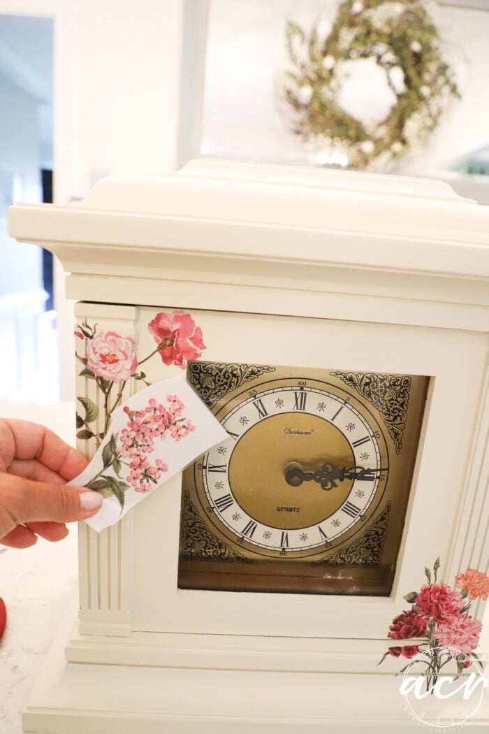
So I decided to add this little one to the mix there.
Much better, right??
And as the creative process continues to go, I considered adding this one somewhere on the top.
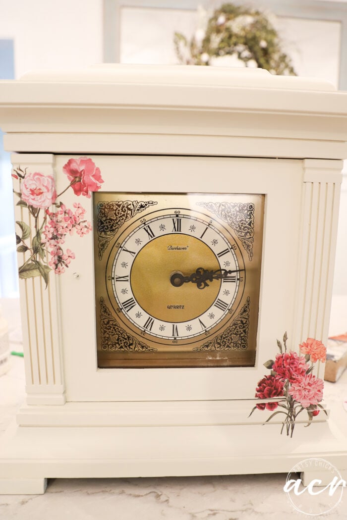
But decided to keep it simple instead. What do you think??
But wait! Not done yet.
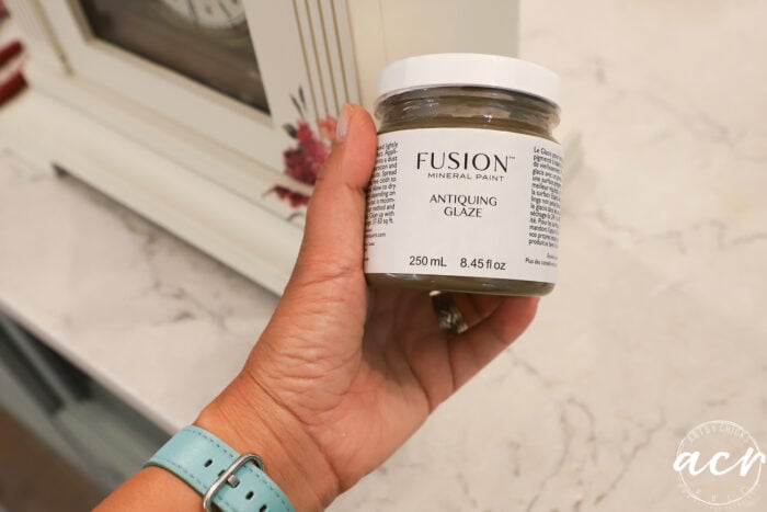
Since this looks like an old mantel clock, I decided to pull out my Antiquing Glaze and antique it right on up!
Antiquing Glaze
I used a brush to apply it to make sure I’d get it in all the cracks and crevices.
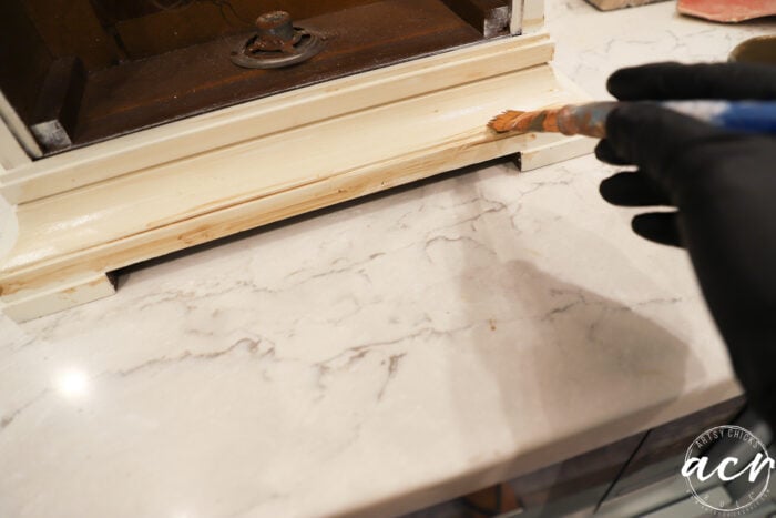
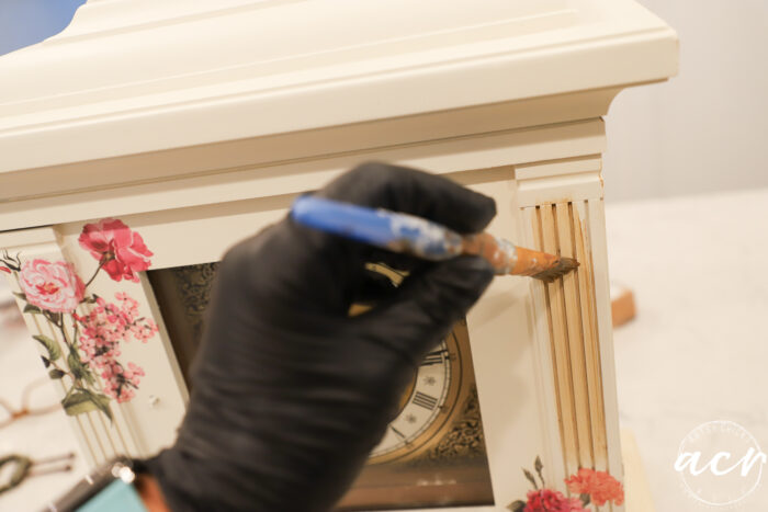
Then I used a soft old t-shirt to apply it and wipe away, etc.
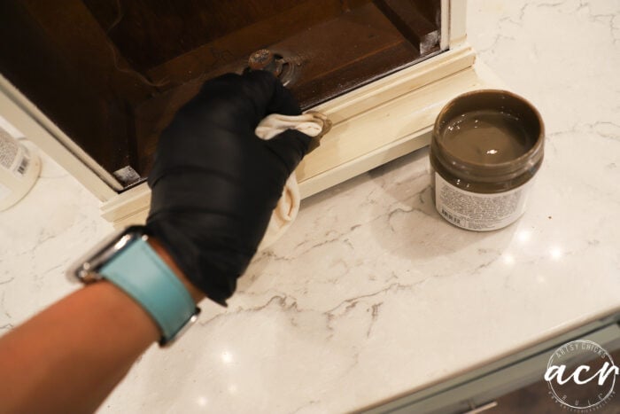
For antiquing glaze like this, you apply it, then wipe it back. It’s really pretty simple!
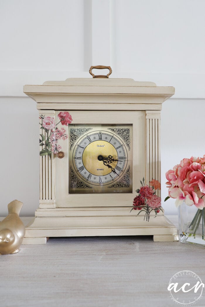
So much better! I think this look is perfect for this clock. (and that paint color)
HARDWARE
I decided to pull out my Gilder’s Paste Wax for this.
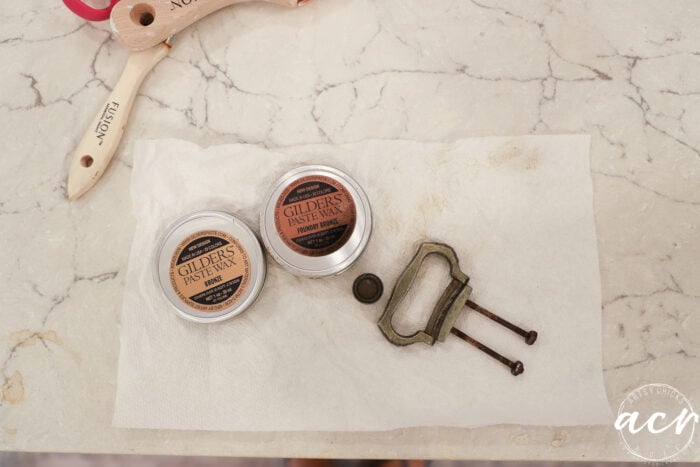
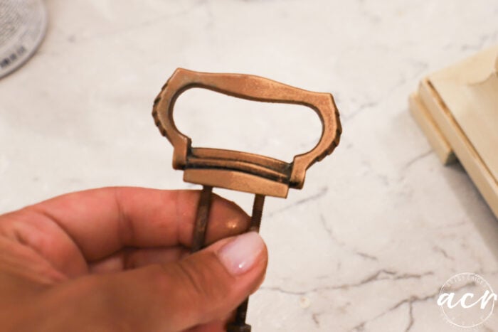
I first used the Foundry Bronze… (can you see where I’ve added to the top and right but not the left??)
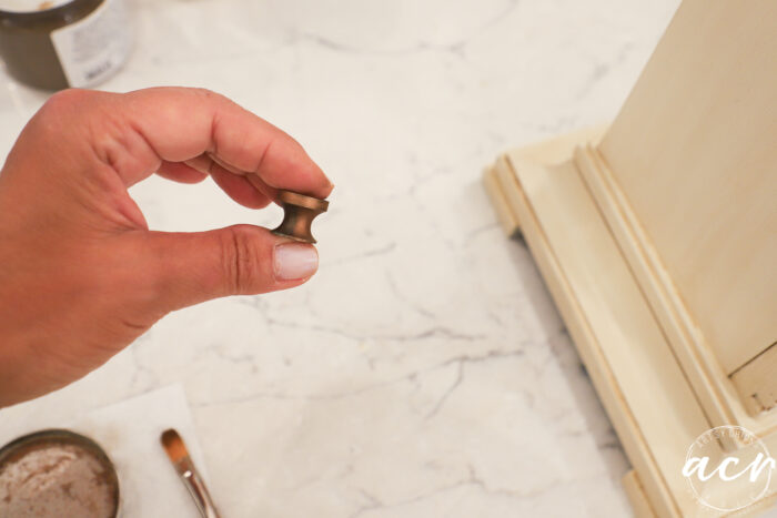
It’s so easy to use. You just rub it on and it’s like magic.
I decided to add a little “gold” hint. Bronze was perfect for that without being too gold-ish.
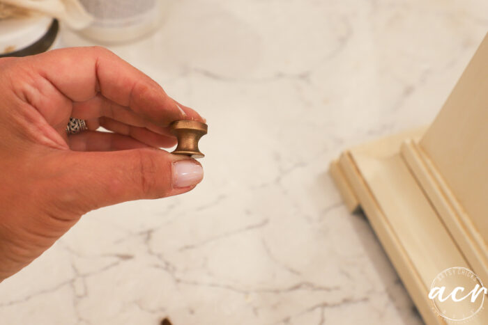
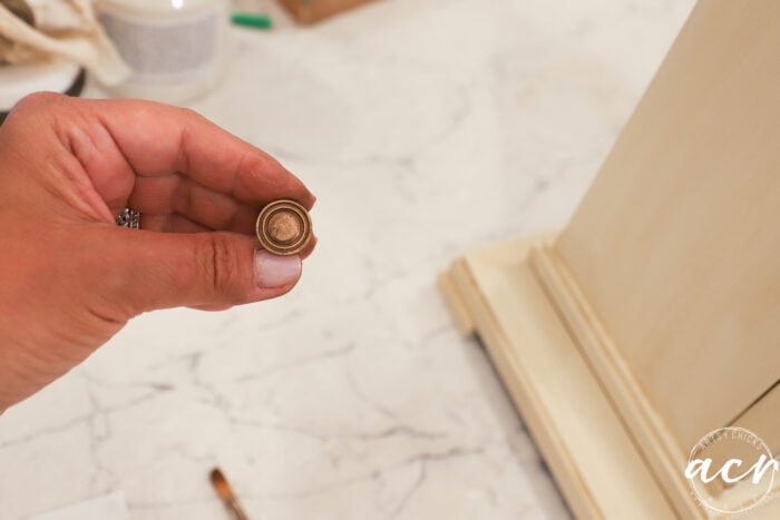
See how it highlights the metal??
Here’s the top piece with the Foundry Bronze on the left and the “hint” of Bronze on the right.
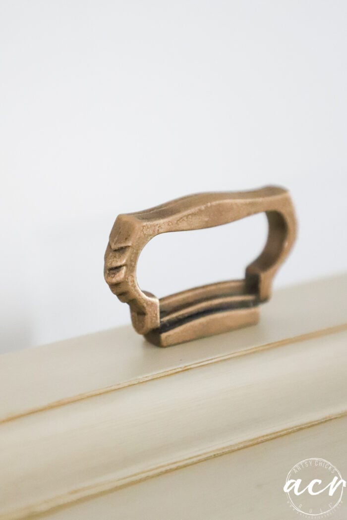
And done!
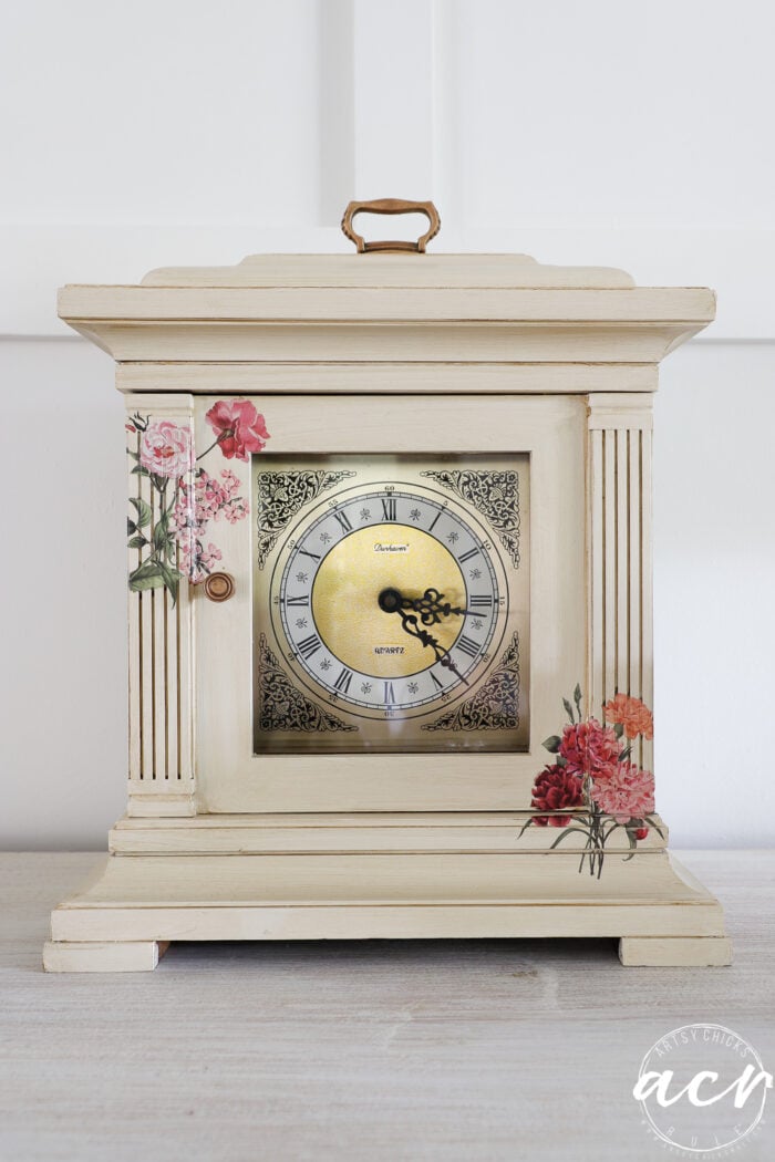
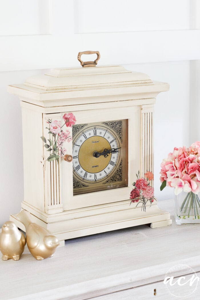
Isn’t the “aging” (Antiquing Glaze) just perfect for this piece?
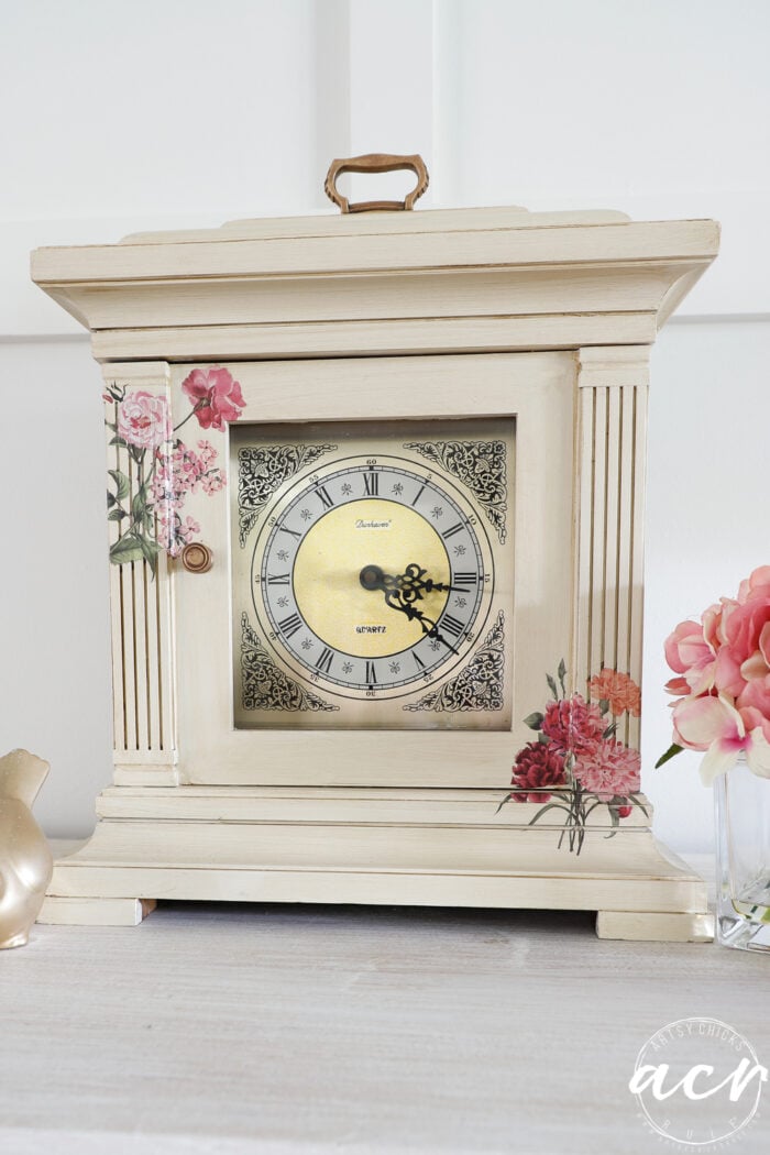
I’m loving the new look!
PIN it to save it!
Don’t forget to hop over and check out what my friends are up to this month!
Have a wonderful week!
xoxo


")


Your instinct on the transfer lil extra was perfect.
Sometimes people go overboard with transfers, this was perfect! All the aging effects are really nice. This is a great piece!
Thank you so much, Jacy! I’m so glad I didn’t overdo it too. Sometimes less really is more! :) xo
Thank you, Janet! I’m so glad I added it too! :) xo
What a refreshing makeover! All the details you added, Nancy, really take this boring piece over the top. Bravo!
Thank you, Larissa! xo
Drab to cheerful! As far as the broken transfer, I like things that are not perfect because they are more interesting. Could that gilders paste be used all over a dark metal light fixture or would it look weird in such a large amount? Thanks always for sharing your materials and process!
Love that, thanks, Ruth! Great way to look at it. And yes, it sure can. I used the Gilder’s paste on the the light fixtures in our kitchen and dining room. You can use it on so many things! I love how it adds a glint of color or more color depending on application. :)
This is a keeper! I love the color and just the right amount of transfers.
Thanks, Sherry! I’m so glad I didn’t overdo it on this one! xo
So pretty! Love it!
Thanks, Audra! xo
I agree that you’ve given this piece a new life. I see so many plain wood clocks languishing on the shelves of vintage shops; they’re just a bit too old fashioned to appeal to the younger generations. Great job!
Thank you, Mary! Yes, there do seem to be quite a few out and about and freshening them up with paint is just what they need! :)
Absolutely perfect. Any more would have been overdone; the subtle difference on the metal bits was also exactly right. This piece is just my style, lol!
Thank you so much, Sheila! I think so too. I’m so glad I stopped there! :) xo
The new look is beautiful Nancy! I have a clock similar to this so you’ve sparked some ideas! XOXO
Thank you, Denise! Oh that’s great!! xo
It’s so pretty now! Transfers are so fun to play with! For that piece that split, I would just find another flower that is similar in color and cut a piece of it to fill that in. You won’t even notice that it doesn’t match up perfectly! XOXO.
Thanks, Christy!! And yes, that would work too!! :) xoxo
i think paint was the way to go on this one, Nancy. The plain wood was a little boring, and the transfers with the new color really make it sing now!
Thanks, Marcie! I like leaving the pretty wood sometimes but sometimes they just need a good refreshing that only paint will do! And you are so right, the plain wood was boring on this one for sure. It’s always amazing to me how different they look! xo
Oh my word isn’t that pretty!!!! You really gave this a beautiful new life, Nancy! I love the colors and gilding and transfers you chose. It’s absolutely lovely.
Aw, thanks Michele! It’s so much fun to do…creating completely new looks for these old pieces!! xo
LOVE the clock!
Thank you, Rose! xoxo
So pretty! Great new look without going overboard. You inspired me to look for transfers and 2 wooden boxes to transform into birthday gifts.
Oh, I love that!! What a great idea!! Have fun and and thank you!
What a difference! It’s beautiful. Love the color and transfers used. So pretty.
Thanks, Debra!! 🥰
That outdated clock is perfect now – beautiful work, Nancy! xo
Thanks Jen!! xo