DIY Weathered Love Signs (simple technique!)
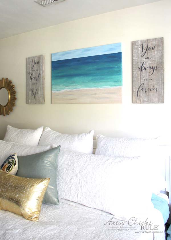
DIY weathered love signs to show your love for someone! Perfect for a bedroom or anywhere.
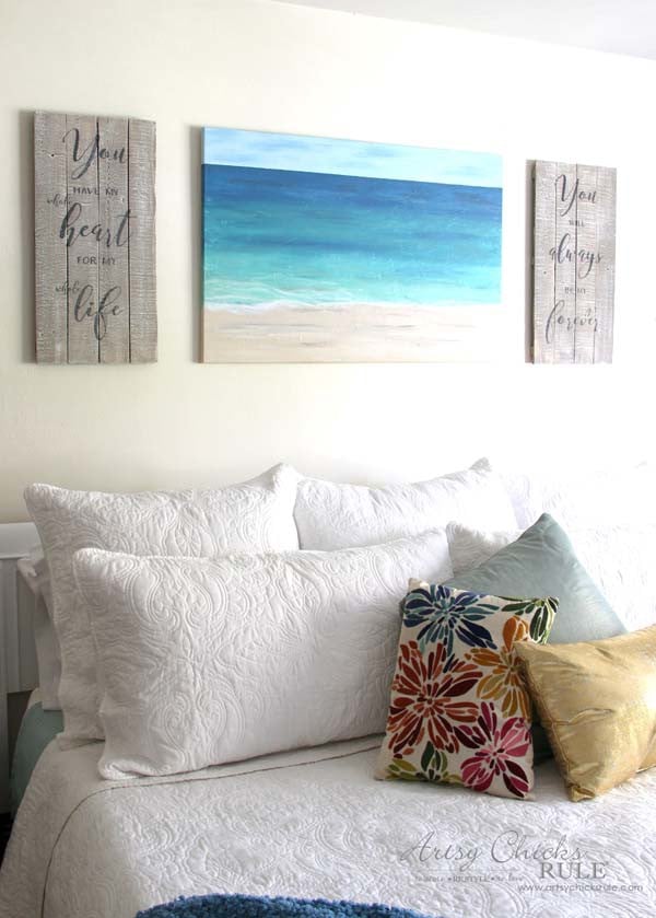
Hi Friends! If you are on Instagram and happen to follow me over there, then you saw these “DIY Weathered Love Signs” yesterday!
I made them…..YESTERDAY for the “Get Your DIY On” themed project… due next week.
Um, except little did I realize I had my dates wrong! Oopsie! ;)
The post date is tomorrow (which is today, by the time you are reading) not next week.
That’s not a very good feeling! Ha! But thankfully, I had them done.
Sort of.
I wasn’t exactly 100% with how they turned out.
Mainly because I envisioned them a bit “whiter” than they ended up.
I was actually getting ready to give them a complete do-over…but I was saved by the bell.
Or… by a Facebook post that brought to my attention my error in dates. ;)
Thank goodness. I wasn’t really excited about painting over them and starting over.
But I may still.
You tell me.
Really.
If you are curious about the painting in the photos, that was last month’s theme. (textured and patterned projects)
You can find out how to make one just like it >>> here.
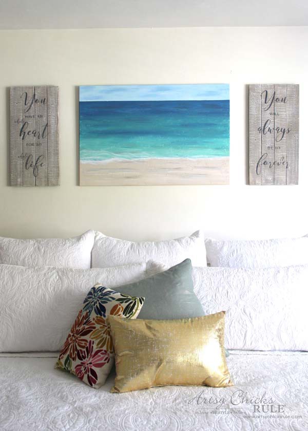
Okay, well, let’s get on with the DIY tutorial…and this month’s theme which is “wall decor”.
DIY Weathered Love Signs
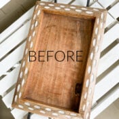
I started with this…

I know, it’s a totally cute sign!! I know, I know.
BUT I bought it with the intention to create these love signs.
Seriously, I really did.
My husband and I were at Kirkland’s before the holidays and they had this sign marked 50% off.
That made it $15, plus I had a $10 off coupon. (it was a grand opening)
So how could I say no?
The minute I saw it, I said, I’m going to cut that in two and make my signs!!
It’s perfect!
I did use it on my front porch for Christmas first though.
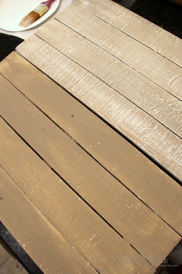
So, cut in half, given a spray of white to cover the lettering and one light coat of Coco Chalk Paint.
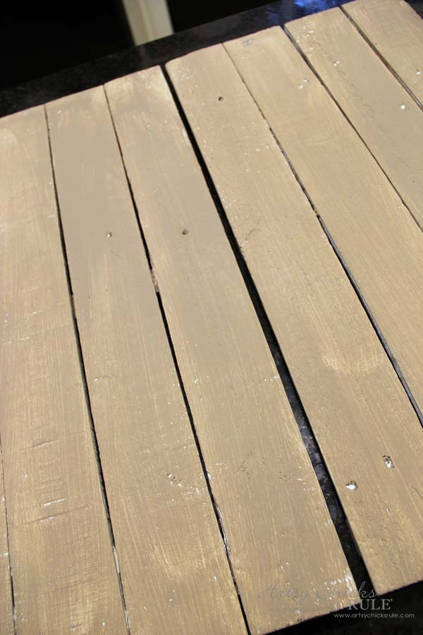
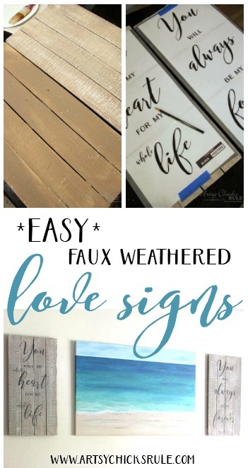
Then I gave it quite a bit of dry brushing with Pure White Chalk Paint.
This was the first layer…
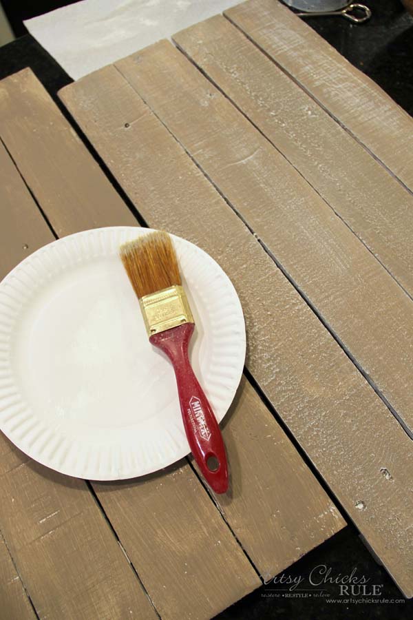
So much so that I thought they looked pretty white?!
See? Don’t they look really white?
So I proceeded with the lettering…..
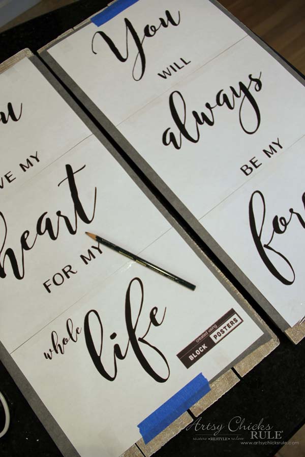
I used >>> this method to transfer those pretty graphics. (it’s SO easy, go check it out! ;) )
Want even more ways to transfer?? Check out my “How To Transfer Graphics” post! (sharing all the techniques I use)
And, you guys, this right here should have clued me in…
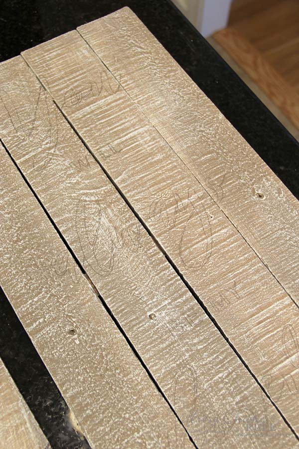
Where’s my lettering?? Hard to see, that’s where.
Because the boards weren’t as white as I originally thought they were.
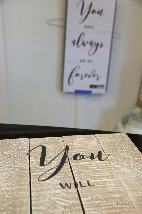
And here’s a tip >>> once you’ve transferred the lettering onto your project, keep the original print in front of you so you can see exactly how it’s supposed to look.
It especially came in handy this time.
I used Graphite (also Chalk Paint) for the lettering.
I know you probably think it takes forever to hand paint these in but it really doesn’t.
I think I spent about an hour painting it all. (total time for both)
Below shows painted and painted with a tiny bit of sanding. (on the left)
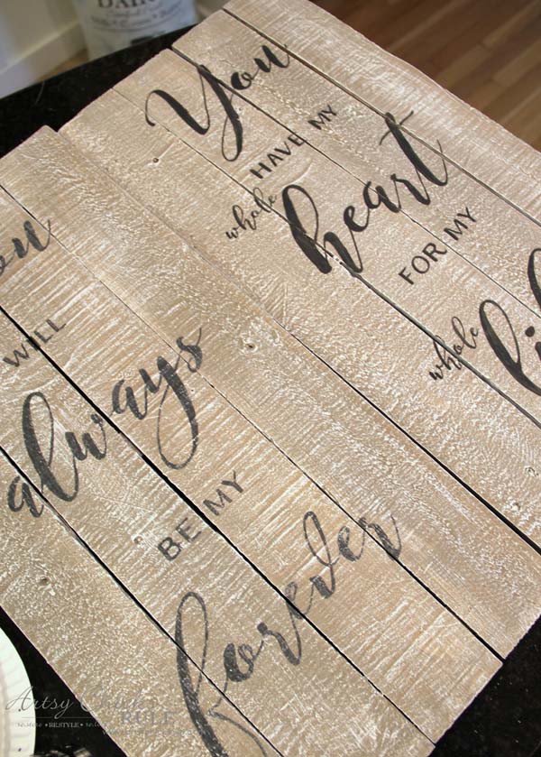
I wanted to soften them a bit.
I also decided to leave them unsealed. I liked the soft, aged, weathered appearance leaving them unsealed gives.
PLUS, they’re going on my wall so no worries of them getting messed up. (except by me when I repaint them … maybe ;) )
So…they do look kind of “driftwood-y” and I like that.
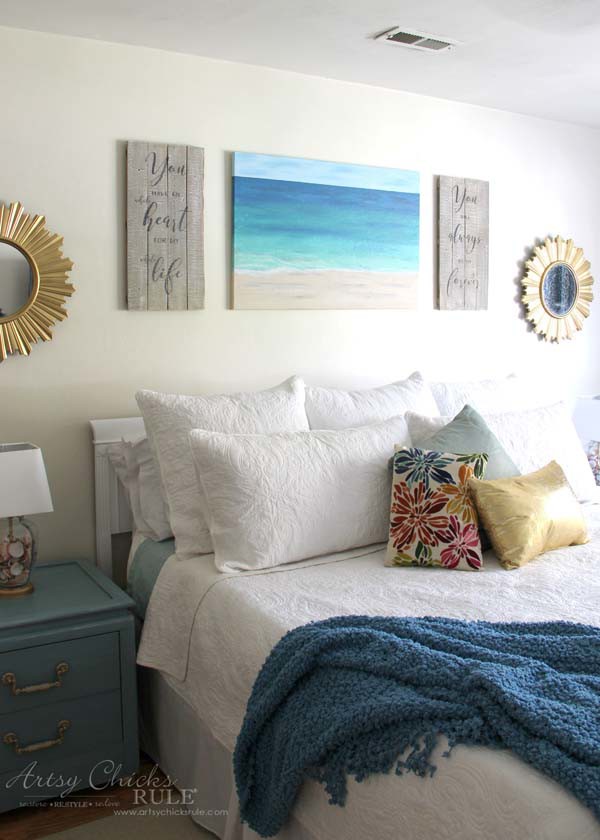
I think I might like them, as-is.
But I’m having a hard time because the actual reality is messing with the vision that was in my head for months.
You tell me.
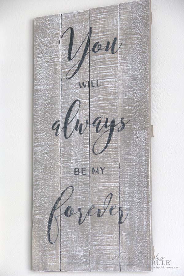
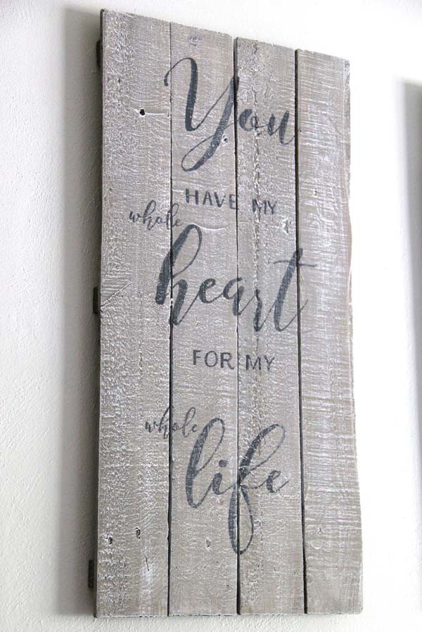
Oh and I almost forgot.
Would you all like to use these graphics??
You can download them for free here…


By the way, I used blockposters . com to print them out.
I love printing larger sized graphics over there. So easy!
Okay, so if you want to make your own…
…be sure to PIN for later!
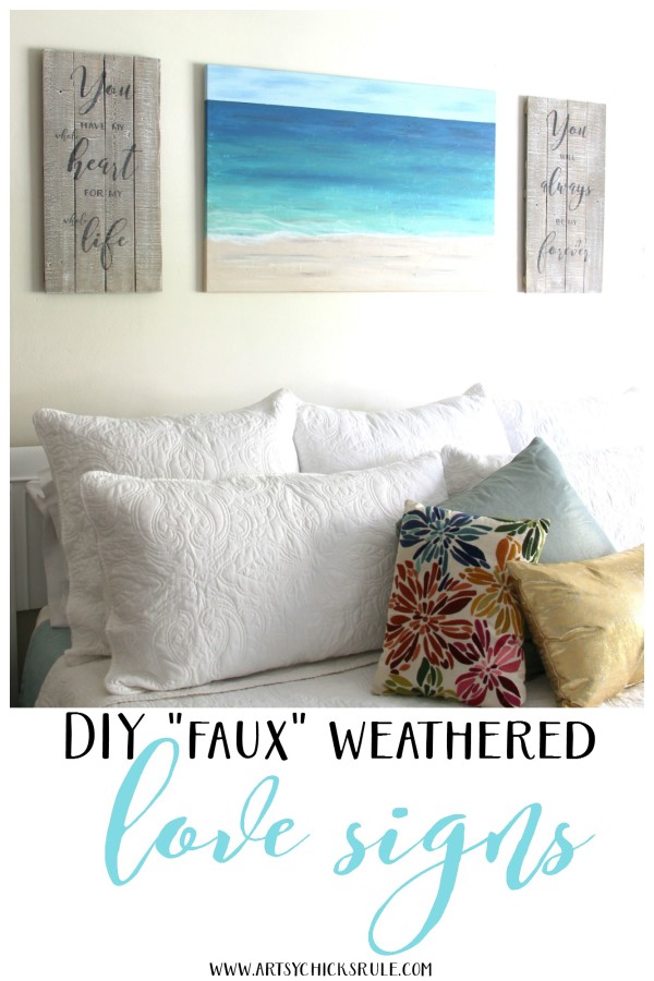
…or Pin this one with more photos.
Okay, now let’s see what my “Get Your DIY On” friends created with “wall decor” this month…..
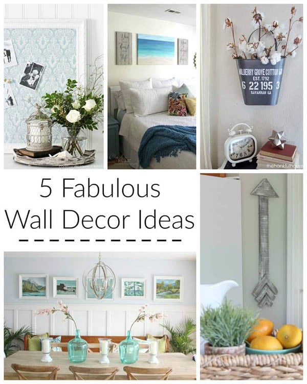
Artsy Chicks Rule – “DIY Weathered Love Signs” (my project)
Confessions of a Serial DIYer – “Thrifted Fabric Covered Bulletin Board”
House of Hoff – “Pallet Wood Arrow”
The Happy Housie “Thrift Store Vintage Painting Gallery Wall in the Dining Room”
The Hankful House – “ Cotton Gin Hanging Pail”
……………………………………………………………………………………………………
So, what’s the verdict?? Weathered love signs? Too weathered?
More white…or keep them as-is?
Let me know your thoughts below in the comments!
And have a wonderful weekend too!!
Check back next week when I share what I did with this old mirror!
UPDATE!! See it now, here!
xoxo







They are beautiful the way they are, but if you aren’t happy with them now, you never will be! You are such a wonderful talent, so change them! Love following your instagram and look forward to getting your emails and diy info!
Blessings from Minnesota,
Cheryl from Hopping Wren Furniture
Aw Cheryl!!! Thank you! :) I’m so happy to “meet” you! You are too kind and have totally made me blush!! ;)
Hope you have a wonderful weekend!
xo
Nancy
Love love what you have done. They are perfect as they are.
Okay, yay! Thank you Cathy! :)
xo
Nancy
I think more white would tie everything in your bedroom better. They sayings are wonderful….especially for a master bedroom!
That’s exactly what I was originally thinking! Thank you for the input!
I do love those sayings too. :)
xo
Nancy
I love the signs just the way they are without additional paint to make them lighter. They have a more drift wood appearance that coordinates exceptionally well with the ocean scene in the picture.
Oh yes, you are right Terry!! I think so too now that you say that. :)
Thanks so much for the input!!
xo
Nancy
Thank you so much for the graphics. I have a new computer and am having trouble saving them. Should they be saved as a photo or PDF or some other way?
I think your signs are beautiful, but I do think they would look better on your wall if the boards were a little lighter color.
Hi Tara!
You are very welcome. :)
When you click on the link (that one that says “here” that’s highlighted) it will take you to the page with the graphic. You should then be able to click the little down pointing arrow, just above the graphic, and download it. It will save as a jpg.
Hope that helps! :)
Oh and thanks for the input also!!
xo
Nancy
Maybe the background could use more white….but what do I know. The wording is awesome. Good job!!
Thanks Charlotte! :) I’m thinking you know a lot!! ;)
I’ll probably give em a do-over!
xo
Nancy
Hi Nancy
Wow – they look beautiful with your painting.
Just the perfect look and the sayings are perfect.
Have a wonderful day
Rose
Thank you Rose!!
Have a wonderful weekend, friend!
xo
Nancy
I think they look wonderful, Nancy, but I can see where you might have wanted them a little whiter. Maybe live with them a little while, and if they don’t grow on you, then re-do them. That will probably be the only way you will be happy with them. :)
And the sayings are wonderful, too! Thank you for sharing them with us! xo
I think that’s what I’ll probably do Karen! I have so many other things going on so they’ll have to stay that way for a bit. But I’m guessing they may get the makeover.
Hope you are doing well!! :)
xo
Nancy
Hi Nancy
Your room looks beautiful! I like this driftwood color but for me I’d like it whiter with a grayish wash if I were placing it close to the gold accents. But I love them in this authentic driftwood finish and the sayings if they were used in a different place so they didn’t have to compete with the gold. Love your painting Nancy!
Lynn
Hi Lynn!
Thank you! :)
I think you are right. I do love the finish actually but am thinking they look a little out of place with the gold mirrors too.
Thanks so much for your thoughts!! It really does help to get everyone’s opinion since I’m sort of up on top of them. (and it’s hard for me to be as objective!)
Hope you have a great weekend!
xo
Nancy
Really lovely !!!
Thank you! :)
Nancy
hey girl love the signs!
Thanks a bunch Shawnna!! :)
xo
Nancy
I love the signs with the weathered look. However, with the gold in the mirrors and the white bedding I think a bit more white would blend better with your decor. I also like how they look next to the painting.
I think you are so right! I love the finish but do think it’s a bit out of place with the gold. I love contrast and contrasting textures, finishes, etc, but it may be a bit too contrasting.
Thank you so much! :)
xo
Nancy
What a great transformation Nancy! Love it in your room :) Beautiful!
Thanks Mandy!!
xo
Nancy
LOVE love LOVE these!! I love them as is…nice contrast to everything else! XO
Thank you Christy!!! I’m leaning more and more to leaving them! (and it’s EASIER, which I need!! lol )
xo
Nancy
Oh my goodness Nancy, they are perfect in every way. They look so good anchoring your pretty painting! LOVE – Pinning
Thank you Marie!! :)
xo
Nancy
If you aren’t happy then no ones happy but you asked so here goes –I could kind of tell a whiter version by looking at your printed sayings. Too white. The moment I saw these on either side of your painting –to me–who lives by a certain beach with lots of driftwood–I suddenly thought the painting made sense to me. They are the color of sand on CA beaches. Plus the color of all the driftwood too!! So I immediately thought–beach scene flanked by sand and driftwood. Yet not all be achy with starfish dangling and painted on. Classy. Done so tenderly sweet.
But if one goes to the beach in N Carolina where the sand is white I can see where one thinks whiter…but from a CA beachpoint of view? The color is perfect!!!
So true Gwen!! ;)
Yay!! I’m thinking they are staying this color! I love your description…perfect! :)
Thanks so much for the input. xoxo
Nancy
Keep them the way they are, which is beautiful!! Love the signs!!
Aw thank you Crystal! Yes, I do believe I am leaving them as is. They have definitely grown on me now! :)
xo
Nancy
I like them exactly like they are. The color reminds me of sand which goes right along with your ocean painting. You got a real deal on the Christmas sign that you used to make these. :)
Thanks Paula!! I have pretty much decided to keep them as-is. I have grown to love the color!
xo
Nancy
l love a beachy look. I have it in my whole condo (not really on the beach)! And I love your signs. But to me, they over power your beautiful painting. They need to be smaller or lighter. Just my opinion of course.
Yes, I had originally intended for them to be lighter in color but they ended up darker and by the time I realized, I had already put the wording on. Boo! I have actually since changed the room so no longer have any of that up now though. :) Not sure if I will reuse those or sell them yet. (still mid makeover)